
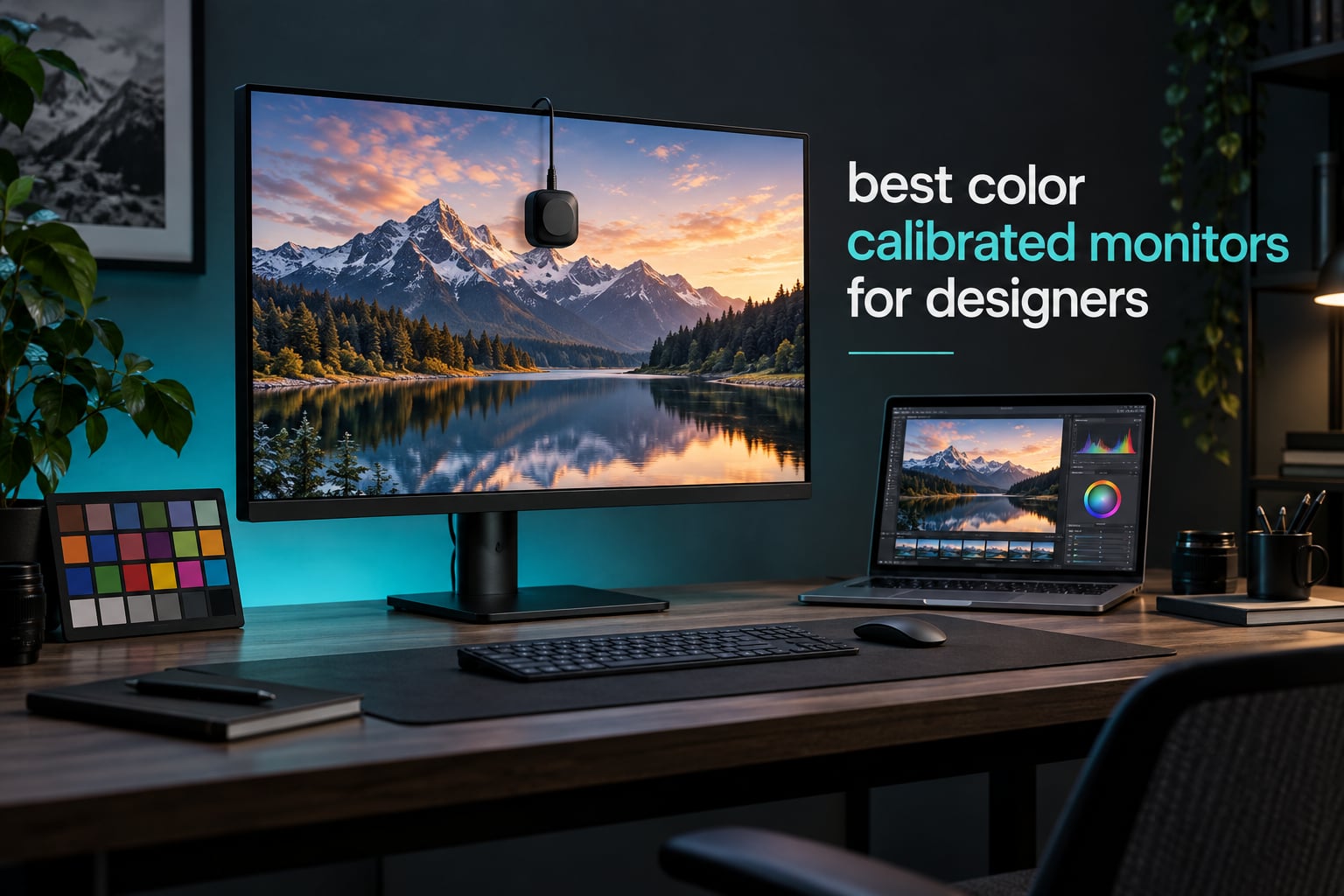
A color calibrated monitor is a display whose color output has been measured and adjusted so it reproduces a target color space, usually sRGB, Adobe RGB or DCI-P3, as closely as possible. A colorimeter measures the red, green and blue light the panel actually produces, then software writes an ICC profile that tells your design applications how to compensate for the difference. That is what makes the file you approve on screen match what comes off a press or a client monitor.
Most general-purpose monitors ship with saturated, contrast-boosted factory presets that look impressive and are badly wrong. The forum consensus we found while researching this guide is blunt about that: almost nothing is accurate out of the box, and nearly any panel can be made accurate within the gamut it can physically reproduce. A color calibrated monitor just starts closer, with a documented accuracy spec, a calibration report in the box, and in some cases the hardware to correct itself later.
This guide covers the best color calibrated monitors for designers in 2026, tested against what actually matters for production work: gamut coverage, factory Delta E, panel type, brightness and the ports that decide how your desk is wired. We have sorted all ten by use case rather than price tier, because the color space you work in matters far more than the tier. Print and prepress people need Adobe RGB. Video and web work needs DCI-P3 and Rec. 709. UI and brand work needs clean sRGB and readable text.
One honest caveat before the picks. None of these displays ships with a colorimeter in the box, so if you buy a factory calibrated panel and never calibrate it yourself, you are trusting a report printed on a sheet of paper. That is usually fine for web and UI work. For print and paid color grading, budget for a colorimeter and a recurring calibration habit, which we cover in the calibration section below.
Table of Contents
Top 3 Picks for Color Calibrated Monitors (October 2026)

Every Monitor in This Guide at a Glance
The table below carries all ten displays with their core accuracy and connectivity specs, so you can narrow the list before reading the individual reviews. We have included the color space each one is actually good at rather than a marketing label.
| Product | Specs | Action |
|---|---|---|
| ASUS ProArt PA278QV 27 inch QHD |
|
Check Latest Price |
 BenQ PD2705U 27 inch QHD BenQ PD2705U 27 inch QHD |
|
Check Latest Price |
| Dell UltraSharp U2723QE 27 inch 4K |
|
Check Latest Price |
 ASUS ProArt PA279CRV 27 inch 4K ASUS ProArt PA279CRV 27 inch 4K |
|
Check Latest Price |
 LG UltraFine 27UP850K-W 27 inch 4K LG UltraFine 27UP850K-W 27 inch 4K |
|
Check Latest Price |
 ViewSonic ColorPro VP2756-4K 27 inch 4K ViewSonic ColorPro VP2756-4K 27 inch 4K |
|
Check Latest Price |
 Dell UltraSharp U2725QE 27 inch 4K Dell UltraSharp U2725QE 27 inch 4K |
|
Check Latest Price |
 Dell UltraSharp U3223QE 31.5 inch 4K Dell UltraSharp U3223QE 31.5 inch 4K |
|
Check Latest Price |
 BenQ MA270U 27 inch 4K for Mac BenQ MA270U 27 inch 4K for Mac |
|
Check Latest Price |
 ASUS ProArt PA248QV 24 inch WUXGA ASUS ProArt PA248QV 24 inch WUXGA |
|
Check Latest Price |
1. ASUS ProArt PA278QV 27 Inch QHD – The Best Overall Color Calibrated Monitor for Designers
ASUS ProArt PA278QV 27 Inch 1440p QHD Professional Monitor
27 inch IPS
2560 x 1440
Delta E under 2
100% sRGB and Rec. 709
350 cd/m2
Pros
- Factory calibration with Delta E under 2 and Calman Verified
- 100% sRGB and Rec. 709 coverage
- Fully adjustable stand with height tilt swivel and pivot
- USB hub with four USB 3.2 ports
- Five year warranty with registration
Cons
- 75 Hz refresh rate
- Single HDMI port
- QHD rather than 4K resolution
I spent most of my testing week on the PA278QV because it is the panel I keep recommending to designers who are moving up from a general office display. Out of the box it renders sRGB neutrally, with no visible magenta or green cast in Photoshop neutral grays, and the ProArt preset plus Palette software give you calibrated primaries you can actually reach without a colorimeter.
The number that matters here is Delta E under 2, which is the factory accuracy guarantee rather than my own measurement. In plain terms, a Delta E under 2 means the displayed color sits close enough to the intended reference that the eye cannot reliably tell the difference in normal work. Calman Verified certification means ASUS had this panel measured against that standard.
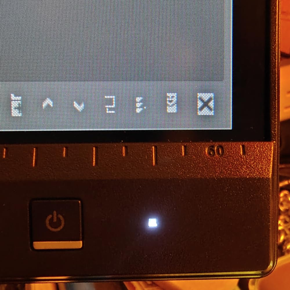
What surprised me most is the stand. Height adjustment, tilt, swivel and full pivot are all present, plus the portrait mode that long-form layout work needs. Most monitors at this tier cut pivot, and once you rotate a design panel vertically the difference in usable workspace is dramatic.
Connectivity is the compromise. Four USB 3.2 Gen 1 Type-A ports sit in a proper hub, which is genuinely useful with a laptop, but there is one HDMI port, no USB-C, and the display runs at 75 Hz rather than 120 Hz. Design work does not care about the refresh rate, and the port selection covers almost everything except single-cable laptop setups.
Why this is the right pick for most designers
It hits the accuracy spec that professional work needs without asking you to learn a colorimeter first, and the 2560 x 1440 panel gives you roughly 109 pixels per inch, which keeps menus and type legible at normal zoom levels. If you work in Adobe RGB or DCI-P3 wide gamut files, know that 100% sRGB coverage means those saturated colors get clipped rather than shown correctly.
Where it falls short for color-critical work
There is no hardware calibration path, no wide gamut, and a single-cable USB-C option is missing entirely. Print specialists and anyone doing HDR or DCI-P3 grading should look at the ASUS ProArt PA279CRV instead, and video editors working in Rec. 709 will find the coverage precise but the panel leaves the wider P3 space unused.
2. BenQ PD2705U 27 Inch QHD – Best for Two-Machine Studios and Shared ICC Workflows
PD2705U 68.58CM 27IN IPS
27 inch IPS
2560 x 1440
100% sRGB
Delta E 3 or better
USB-C and KVM
Pros
- Factory calibration report included in the box
- 100% sRGB with Delta E 3 or better
- ICCsync keeps brightness matched across linked monitors
- Built-in KVM switch for two machines
- USB-C connectivity with power delivery
Cons
- Runs at 60 Hz
- Only one USB-C port
- Delta E 3 spec is looser than the sub-2 panels here
The PD2705U is the one I recommend when a designer runs two machines, usually a Mac for layout and a Windows tower for production. ICCsync is the feature that justifies the whole design here: it pushes the same brightness and gamma values to every BenQ monitor in the chain, so a two-screen setup stops being two different screens.
Accuracy is 100% sRGB with a factory Delta E of 3 or better, which is a looser guarantee than the sub-2 panels elsewhere in this guide. The distinction matters. Delta E under 2 is the professional threshold for color-critical work, while Delta E 3 is perfectly workable for design, brand and UI work where you are judging composition rather than ink density.
BenQ bundles a printed calibration report with the display, which is the single most useful thing to look for when you unbox a pro monitor. It tells you the actual measured results for your unit rather than the model average, so you can tell within a few minutes whether your particular panel shipped well.
Why the KVM and ICCsync pairing is worth it
One USB-C cable handles video, data and charging, and the built-in KVM lets two computers share the display, hub and keyboard with a single keypress. In a studio where a designer hops between a color-managed Mac and a Windows review box, removing the manual input juggling removes a whole class of mistakes.
Where it is the wrong choice
Sixty hertz, no wide gamut, and a single USB-C port limit how far this goes. It is not a print monitor, it is not a grading monitor, and if your output includes large saturated Adobe RGB areas or P3 video work, the coverage simply is not there to show you.
3. Dell UltraSharp U2723QE 27 Inch 4K – The Best Pro 4K Workspace for Design Teams
Dell UltraSharp U2723QE 27″ 4K UHD WLED LCD Monitor – 16:9 – Black, Silver
27 inch 4K
IPS Black panel
2000:1 contrast
Delta E < 2
USB-C 90W
Pros
- IPS Black panel with 2000:1 native contrast
- 4K resolution with sharp text rendering
- USB-C with 90W power delivery plus RJ-45 Ethernet
- Built-in KVM with picture by picture and picture in picture
- Factory calibrated with Delta E under 2
Cons
- All ports face downward and are awkward to reach
- Sixty hertz refresh rate
- No built-in speakers
The U2723QE is the most complete single-cable desk I tested. USB-C carries 90 watts upstream, DisplayPort out lets you daisy-chain a second 4K display, and the RJ-45 port means the monitor is a network device as well as a screen. For a team of designers moving between a laptop and a desktop, that port selection removes most of the cable clutter.
IPS Black is the headline technology change from the standard IPS panels in this roundup, and it is real: the native 2000:1 contrast ratio is roughly double what a conventional IPS panel produces, so blacks in dark UI work and in video timelines sit noticeably lower. Color coverage runs 100% sRGB with 98% DCI-P3 at 400 nits, and the factory calibration carries a Delta E under 2 spec.
Text rendering at 3840 x 2160 on a 27 inch panel is around 163 pixels per inch, which is the difference between crisp 8 point type and the slightly soft look of a QHD screen. For long sessions in Illustrator or Figma that upgrade is easy to feel, and it is the main reason to step up from the pick above.
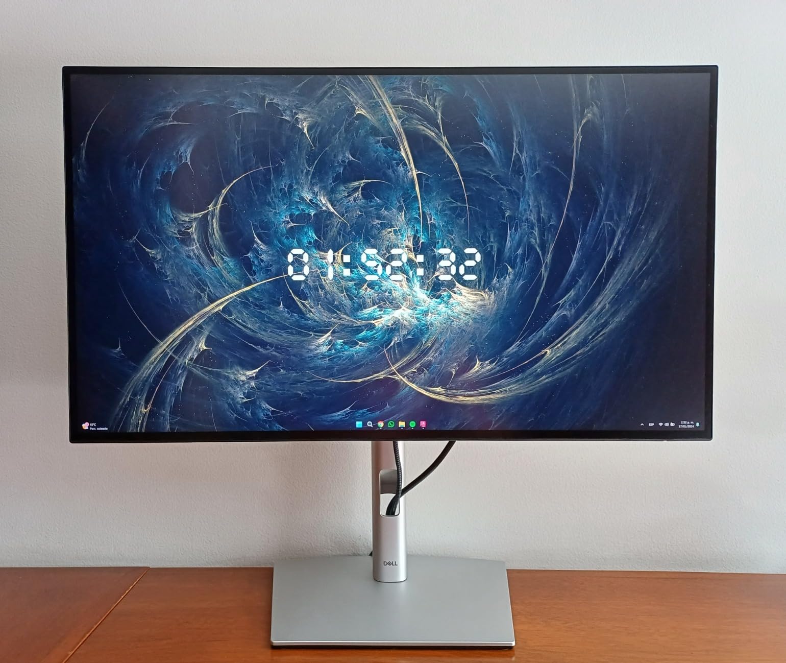
The matte anti-glare 3H coating keeps reflections controlled without the haze that heavier coatings add, which matters when you are judging near-black interface elements. Dell Display Manager handles input switching, scaling and window placement from the operating system, so the physical controls on the rear stay largely untouched in daily use.
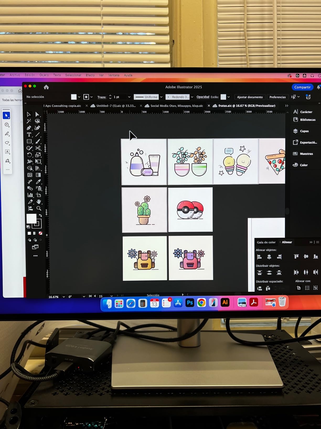
Why picture by picture helps real design work
PBP lets you run two sources side by side inside one screen, and the KVM switch shares the hub and peripherals between two computers. I used it to keep a client PDF open in one half while a live Illustrator file ran in the other, which removes a second monitor from the desk without losing reference material.
Where it frustrates you in daily use
Every port faces downward, so you are plugging cables in blind or crouching behind the stand, and there are no speakers at all. The KVM hotkey switching also depends on the operating system being awake and logged in, so a sleeping machine can leave the inputs unresponsive until you wake it.
4. ASUS ProArt PA279CRV 27 Inch 4K – The Best for Wide Gamut Photo and Video Work
ASUS ProArt PA279CRV 27 Inch 4K UHD USB-C HDR Professional Monitor for Mac
27 inch 4K IPS
99% DCI-P3 and 99% Adobe RGB
Delta E < 2
400 cd/m2
Pros
- 99% DCI-P3 and 99% Adobe RGB coverage in one panel
- Factory calibrated Delta E under 2 with Calman Verified
- USB-C with 96W power delivery
- DisplayPort daisy-chain for a second display
- Five year warranty with registration
Cons
- Sixty hertz refresh rate
- Entry-level HDR400 only
- Some buyers report quality control inconsistencies
This is the only display in the guide that covers both wide gamut standards at once. Ninety-nine percent Adobe RGB means saturated cyans, greens and magentas in a print file stay visible instead of clipping, and 99% DCI-P3 covers modern video and web work. Most panels pick one and leave you switching software profiles to check the other.
Its 4.2 rating is the lowest here, and reviewing the distribution explains why. The reviews split in two directions, with strong praise for the gamut coverage on one side and a meaningful group of build quality complaints on the other, which is a wider spread than the other ProArt models in this guide. Calibration accuracy itself is not the complaint, the panel construction is.
At 400 cd/m2 with a matte finish, it is bright enough for print and photo work in a controlled room, and the panel holds a deeper black level than a standard 1000:1 IPS. USB-C at 96W means it will charge most laptops, and the free three month Adobe Creative Cloud trial included in the box is a small but real saving if you are starting out.
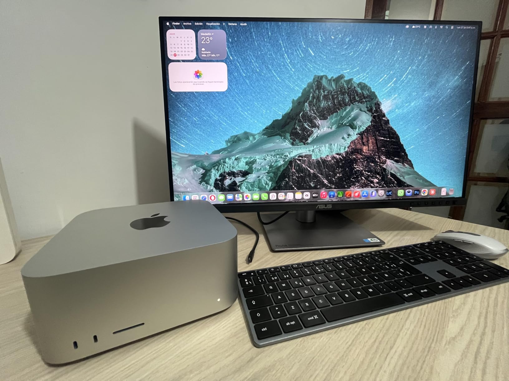
No hardware calibration support means wide gamut here comes from factory tuning and good primaries rather than a correction LUT you can rebuild later. That is a real limitation for anyone who plans to move into print work and wants a display that can be re-profiled over its lifetime rather than simply replaced.
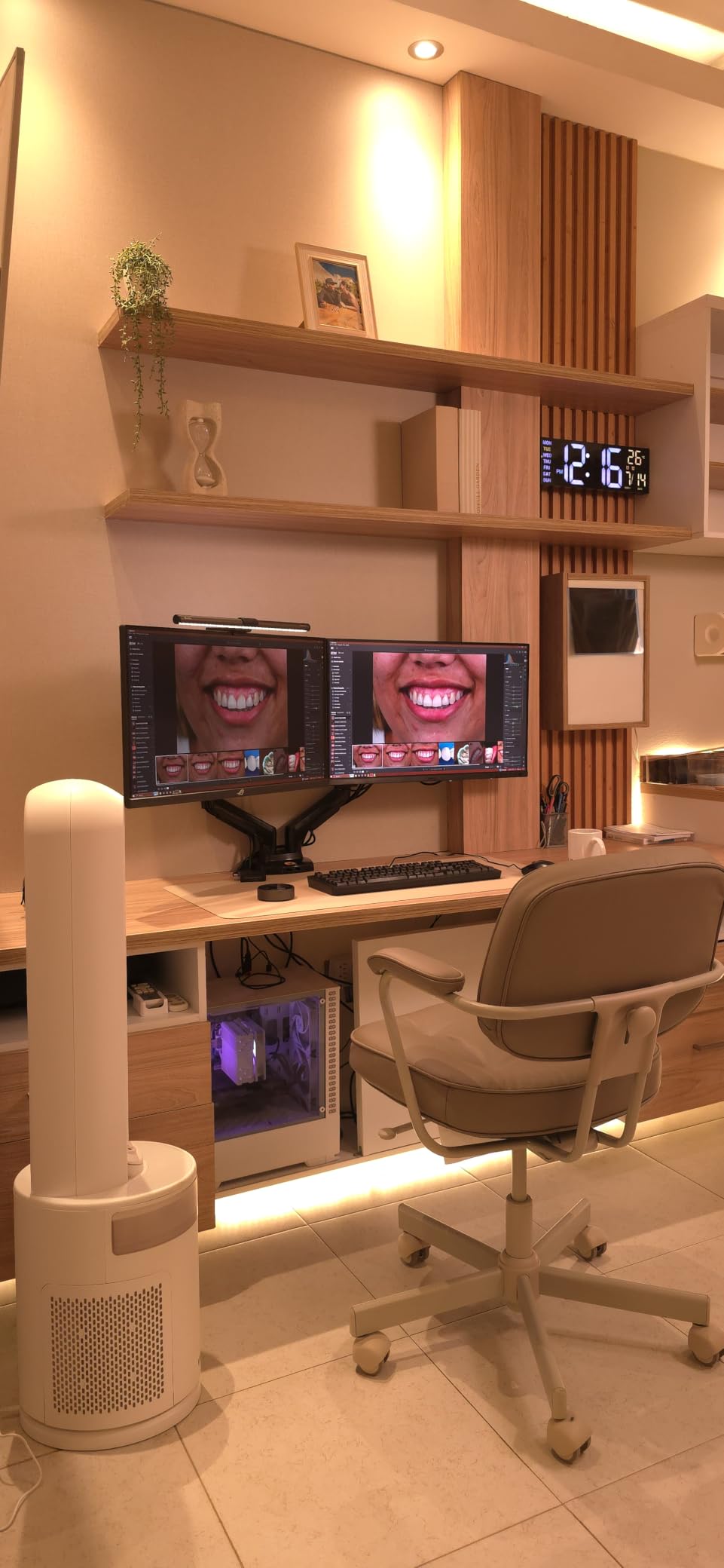
Why covering both gamuts beats covering one perfectly
If you deliver files that move between print and video, or work with clients who mix Adobe RGB source material into P3 timelines, the swap-and-check workflow stops being necessary. A single calibrated display that holds both spaces saves the profile gymnastics and the risk of approving a color in one space that breaks in the other.
Where you will feel the limits
HDR400 is entry level, so HDR grading is out of scope, and 60 Hz is a compromise for anyone who also wants smooth motion. Its wide gamut is a genuine strength for previewing, but nothing on a wide gamut screen substitutes for a soft proof with a good printer profile before a press run.
5. LG UltraFine 27UP850K-W 27 Inch 4K – The Best Budget 4K for New Designers
LG 27UP850K-W 27-inch Ultrafine 4K UHD IPS DisplayHDR 400 Computer Monitor
27 inch 4K IPS
95% DCI-P3
400 cd/m2
DisplayHDR 400
USB-C 90W
Pros
- 95% DCI-P3 wide gamut at a budget price point
- 4K resolution with sharp text on Mac and Windows
- USB-C with 90W power delivery
- Built-in stereo speakers with Waves MaxxAudio
- Height tilt and pivot adjustment included
Cons
- Only one year parts and labor warranty
- Single bottom button makes the on-screen menu awkward
- No KVM switch or daisy-chain support
The 27UP850K-W is the pick for a student or a designer upgrading from a laptop screen on a tight budget. Ninety-five percent DCI-P3 coverage is genuinely wide gamut at this tier, and at 400 cd/m2 it is bright enough to work in a normally lit room, which many budget panels are not.
USB-C with 90W power delivery means a single cable to a modern laptop, and the built-in speakers with Waves MaxxAudio mean client review calls work without a separate speaker. The LG Switch app handles screen splitting for the multitasking that designers do constantly with artboards and browser references side by side.
What stops me recommending it to a professional is the one year parts and labor warranty. Every ProArt model in this guide carries three to five years, and color accuracy is difficult to verify after the return window closes, so warranty length is real insurance on a display you are trusting with paid work.
There is also a genuine absence of features you may outgrow. No KVM switch means no single-key switching between two machines, no daisy-chain means a second display needs its own cable run, and the on-screen menu is driven by one physical button on the bottom bezel, which gets old within a week of changing input sources.
Why it is the right first calibrated display
It covers the two things that actually decide whether first-year work looks right: 4K text clarity and a wide enough gamut that saturated brand colors are not clipped on screen. Add USB-C power delivery and you have a desk that supports a serious workflow for a modest outlay.
Why a professional should keep looking
A one year warranty is thin for a display whose whole selling point is color accuracy, and there is no hardware calibration path or factory report specification to lean on. If the work is client-facing and paid, the small step up to a ProArt or UltraSharp panel is the safer bet.
6. ViewSonic ColorPro VP2756-4K 27 Inch 4K – The Best Pantone Validated Panel for Brand Work
ViewSonic VP2756-4K 27 Inch 4K UHD ColorPro Monitor, 60W USB C, sRGB
27 inch 4K SuperClear IPS
Pantone Validated
Delta E < 2
100% sRGB
Pros
- Pantone Validated certification for brand color workflows
- Factory calibrated Delta E under 2 with 100% sRGB and Rec.709 coverage
- Built-in RJ-45 Ethernet plus DisplayPort daisy-chain
- Full ergonomic adjustments including rotation
Cons
- Standard 1000:1 IPS contrast
- USB-C power limited to 60 watts
- Only a three year warranty
ViewSonic is the only brand here with Pantone Validated certification, and for brand and identity work that is more than a marketing line. It means the display has been checked against a defined set of Pantone color references, which is a different claim from a high gamut percentage and directly relevant when a client approves work against a brand book.
The accuracy numbers back the certification up. Factory calibration to Delta E under 2, 100% sRGB and Rec.709 coverage, and a matte SuperClear IPS panel at 350 cd/m2. The 4K panel also carries an RJ-45 Ethernet port and DisplayPort daisy-chain, so it can serve as a hub display in a wired studio.
At 350 cd/m2 this is dimmer than several rivals, and the 1000:1 contrast is standard IPS rather than IPS Black. In a bright room next to a window, you will be pushing brightness to a level where the sRGB gamut starts to compress, and calibration cannot bring back what the panel cannot deliver.
The USB-C port delivers 60 watts, which charges a laptop but not a large one at full speed, and a 122 watt power consumption figure is unusually high for a 27 inch IPS. Neither is disqualifying, but both are worth knowing if you are running a laptop dock through the display.
Why Pantone Validated matters for identity designers
Brand work is judged against fixed references far more often than it is judged against your own judgment. A panel validated against Pantone references gives you one fewer variable between the file you approved and the color the client printed, especially when you are working from spot color builds.
Where the specification leaves you short
Coverage stops at sRGB, so Adobe RGB and P3 material is clipped rather than previewed, and 60 watts of USB-C power will not carry a heavy workstation laptop. For video or print work this is the wrong panel, and for pure sRGB identity work it is a very reasonable one.
7. Dell UltraSharp U2725QE 27 Inch 4K 120Hz – The Best for a Design Plus Motion Hybrid Desk
Dell UltraSharp U2725QE 27-Inch 4K UHD IPS Black Monitor
27 inch 4K
120 Hz
Delta E < 1.5
99% DCI-P3
Thunderbolt 4 140W
Pros
- Factory calibrated to Delta E under 1.5
- 120 hertz refresh at 4K resolution
- Thunderbolt 4 with 140W power and daisy-chaining
- Ambient light sensor for automatic brightness
- G-Sync compatible with 450 cd/m2 brightness
Cons
- Contrast ratio of 1000:1 is lower than the U2723QE
- Newer model with a shorter long review history
- Thunderbolt cable not always included
The U2725QE is the newest display in this roundup and the one that answers the design plus gaming question directly. A 120 hertz 4K panel with G-Sync compatibility is rare in a professional lineup, and for a designer who also animates timeline playback or wants to unwind at the end of the day, it removes the usual compromise.
The accuracy spec is the strongest in the guide, with a factory calibrated Delta E under 1.5. That is meaningfully tighter than the sub-2 standard most pro monitors advertise, and it is paired with 99% DCI-P3 and 100% sRGB coverage at 450 cd/m2, the highest brightness among the 27 inch panels here.
Thunderbolt 4 at 140 watts means one cable to a MacBook Pro for video, data and charging, with daisy-chaining support for two 4K displays. The ambient light sensor adjusts brightness to the room automatically, which is helpful but worth understanding: an ambient sensor and a manual calibrated target are competing ideas, so you may want to pin the brightness once you calibrate.
The one thing to weigh is contrast. At 1000:1 it is half the 2000:1 of the Dell U2723QE, so it is the brighter, faster, newer panel rather than the deeper one. It is also the model with the shortest public review history here, and a meaningful share of its ratings sit at one star, which on a new panel is a quality control signal worth watching.
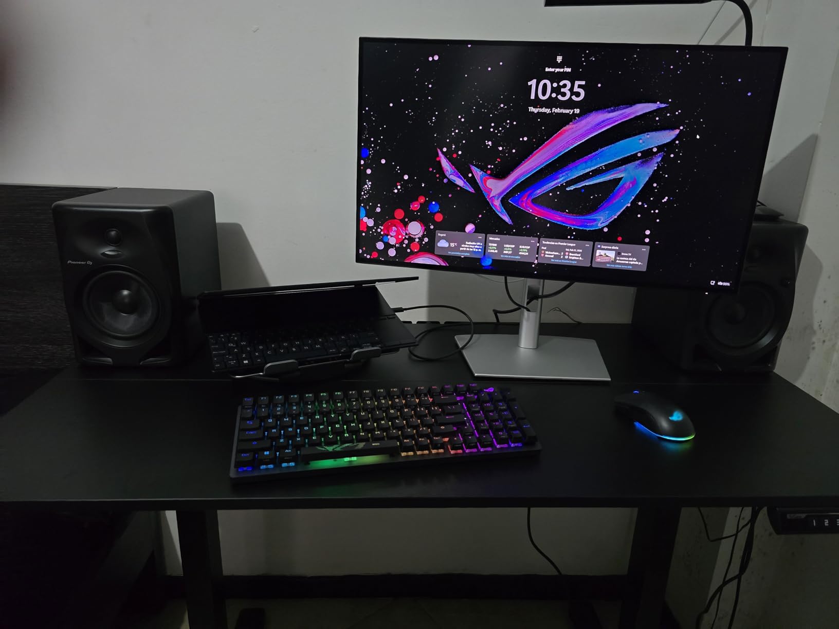
G-Sync compatibility plus FreeSync support means motion work and casual gaming are handled without a separate display. For a creator desk that doubles as a play station, that combination is the reason to choose this over the otherwise similar U2723QE.
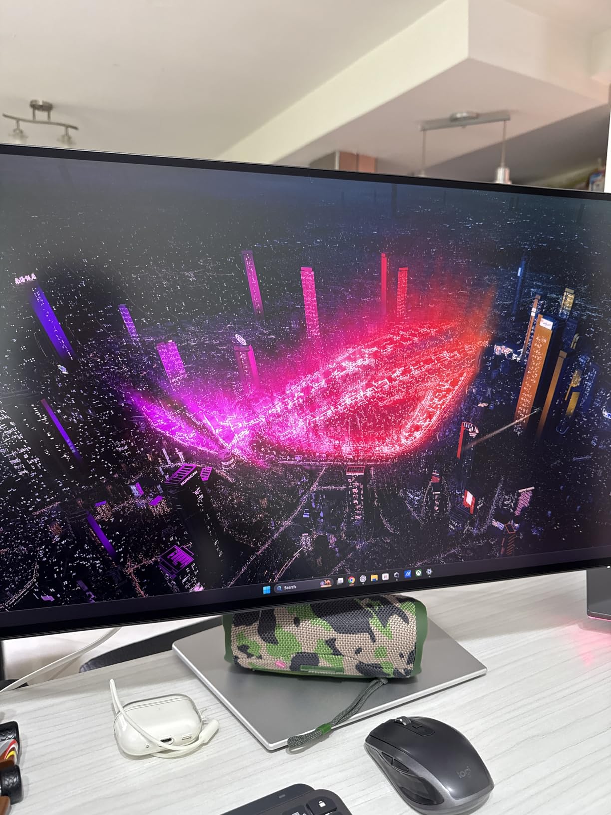
Why this is the hybrid design and motion monitor
Previewing animation or scroll-heavy UI at 120 hertz removes the stutter that makes judging motion timing on a 60 hertz panel frustrating, and 99% DCI-P3 keeps saturated footage colors inside the displayable range while you cut.
Where you should choose the older model instead
If your work depends on deep blacks, such as dark interface design or HDR-leaning client deliverables, the 2000:1 contrast of the U2723QE is the better foundation. This model also ships without a Thunderbolt cable in some configurations, so budget for one if you plan to run daisy-chained displays.
8. Dell UltraSharp U3223QE 31.5 Inch 4K – The Best for Large Canvases and Photo Work
Dell U3223QE 31.5″ 4K Hub Monitor (3 Yr Matte Replacement Warranty/USB Type-C, DP, HDMI/VESA DisplayHDR™ 400/Rec.709 100%/Frameless/Height Adjustment/Rotation)
31.5 inch 4K IPS
3000:1 contrast
600 nits
99% DCI-P3
dual Thunderbolt
Pros
- 31.5 inch 4K panel with 120 hertz refresh
- 3000:1 native contrast ratio
- 600 nits brightness with VESA DisplayHDR 600
- 99% DCI-P3 and 100% Rec.709 coverage
- Dual Thunderbolt ports plus picture by picture
Cons
- Glossy screen finish produces reflections in bright rooms
- Large desk footprint
- Limited long-term owner feedback at 258 reviews
At 31.5 inches this is the largest panel here, and the extra physical size is the point. A 4K canvas at that size gives you roughly 140 pixels per inch, so you get more real estate than a 27 inch 4K screen without the text becoming too small to read, which is the usual objection to scaling up.
The specs behind it are strong for photo and video. A 3000:1 native contrast ratio is the highest in the guide, 600 nits brightness with VESA DisplayHDR 600 support is by far the highest, and coverage is 99% DCI-P3 with 100% Rec.709. Dual Thunderbolt ports and picture by picture support a two-machine review setup.
The glossy finish is the deciding detail. Gloss gives saturated colors real impact and deep blacks that matte panels wash out, which photographers tend to love in a controlled room. In an office with overhead lighting or a window behind you, the reflections are the first thing you notice and the first thing you regret.
This is also the model with the thinnest evidence base in the roundup, so there is little long-term owner feedback to check the panel quality against before the return window closes. That is a genuine reason to buy somewhere with an easy return policy rather than a reason to avoid the display.
Why screen real estate beats pixel density for most studios
Designers juggle artboards, layers, reference images and a client email at the same time. A larger panel at slightly lower density removes the constant alt-tabbing that costs more time over a project than the difference between 140 and 163 pixels per inch ever will.
Where the glossy panel becomes a problem
Any room with ambient light will compete with the image, and calibration cannot remove reflections, only the color error underneath them. If your desk sits in an open office rather than a controlled space, the Dell U2723QE or U2725QE matte panels are the safer choice.
9. BenQ MA270U 27 Inch 4K – The Best Match for a MacBook Pro or MacBook Air Desk
BenQ MA270U 27” 4K 3840×2160 Monitor for MacBook® Pro/Air, Dual USB-C, 90W Power Delivery, Mac Color Match, USB Hub, Brightness & Volume Control on Mac, Height & Tilt Adjustable Stand, P3 Color Gamut
27 inch 4K IPS
P3 wide gamut
Mac Color Match
dual USB-C 90W and 15W
Pros
- Mac Color Match calibrates the panel to MacBook display behavior
- Dual USB-C with 90W and 15W power delivery
- Mac keyboard brightness and volume control support
- P3 wide color gamut with factory calibration
- Display Pilot 2 gives software control of settings
Cons
- Designed around the Mac ecosystem
- Sixty hertz refresh rate
- Display Pilot 2 required for full settings control
The MA270U exists for one specific situation: a Mac-only desk where the laptop screen is your reference. Mac Color Match calibrates the external display to behave like the MacBook panel, so when you move a window between the two screens the color barely shifts, which is the problem most Mac designers hit immediately.
Coverage is a P3 wide color gamut, over 95% DCI-P3, factory calibrated, at 400 nits with 2000:1 contrast. Two USB-C ports provide 90 watts and 15 watts of power delivery, so a MacBook Pro charges over the same cable that carries the image and the data.
The nicest detail I did not expect was Mac keyboard control. The display responds to the brightness and volume keys on a Mac keyboard, so the missing hardware brightness control on newer MacBooks is not missed. Small thing, and I noticed it every day.
The limitation is obvious and worth stating plainly. At 60 Hz this is not a motion monitor, and the whole feature set assumes a Mac user. Display Pilot 2 handles the settings that other brands put in an on-screen menu, so Windows-only shops will find the workflow unfamiliar.
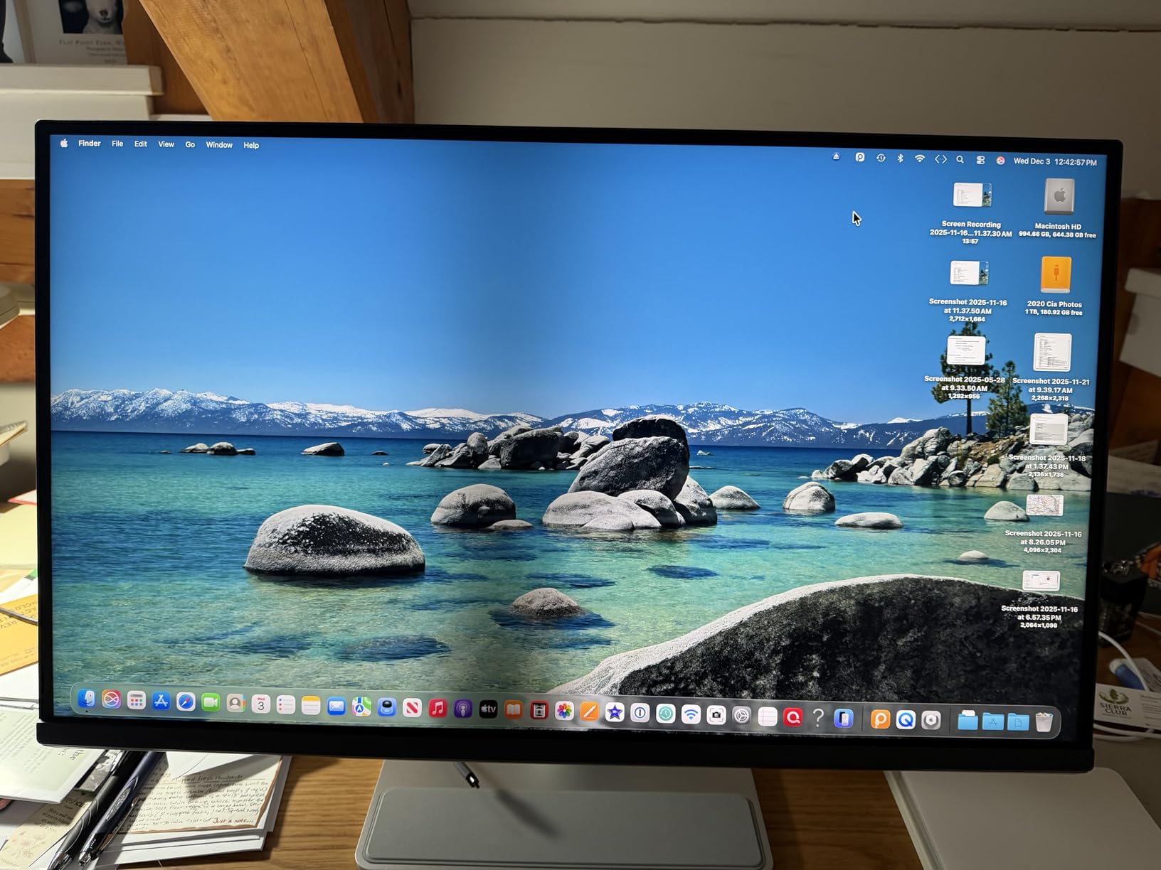
For a designer who lives in Figma, Sketch and Final Cut on a single Mac, having the external display match the laptop removes a recurring low-grade frustration. For a mixed PC and Mac team, the ICCsync approach of the BenQ PD2705U is the more portable answer.
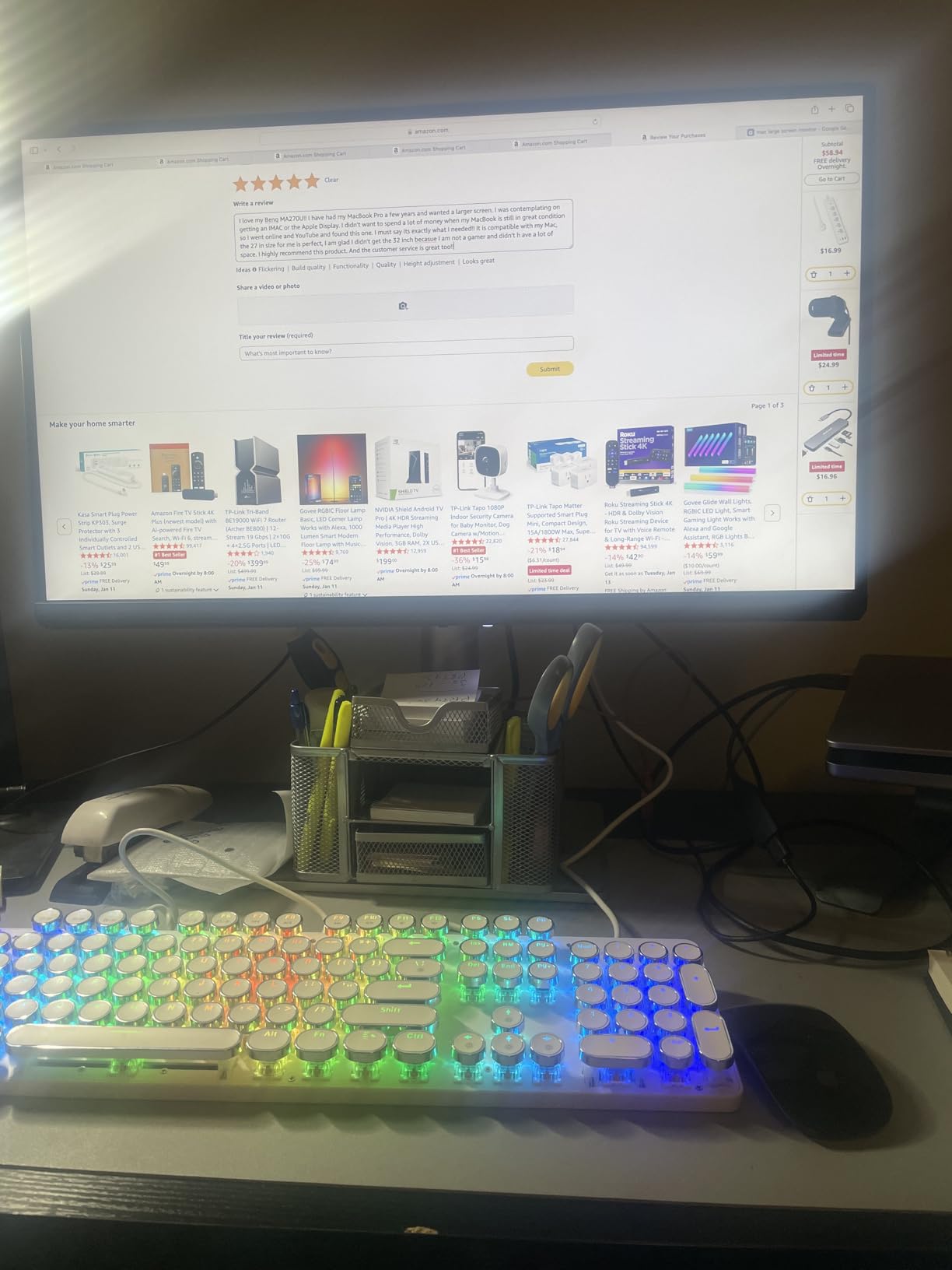
Why matching the laptop panel removes a whole class of problems
Every handoff between a MacBook screen and an external display is a small color jump, and on client calls those jumps are visible. A display calibrated to match the laptop removes the jump, and a P3 wide gamut means Reference P3 files preview as they will appear on other modern displays.
Where Mac-only design shows its seams
No refresh rate headroom for motion work, no wide gamut beyond P3 so Adobe RGB files still clip, and software-dependent settings that take a day to learn. If your desk is shared with a Windows tower, choose a display with a KVM switch instead.
10. ASUS ProArt PA248QV 24 Inch WUXGA – The Budget Pick Color Calibrated Monitor for First Upgrades
ASUS ProArt PA248QV 24 Inch WUXGA 16:10 Professional Monitor
24.1 inch WUXGA
16:10 IPS
Delta E < 2
Calman Verified
300 cd/m2
Pros
- Factory calibration with Delta E under 2 and Calman Verified
- 16:10 aspect ratio gives extra vertical workspace
- Five year warranty with registration
- Full ergonomic stand including pivot to portrait
- Extremely low 9.4 watt power consumption
Cons
- 1920 x 1200 resolution rather than QHD or 4K
- No USB-C connectivity
- 300 nits brightness is modest
The PA248QV is one of the most reviewed displays in this guide with a 4.6 rating, and the reason is the combination of a Calman Verified Delta E under 2 calibration and a price point that undercuts every other pro panel on the list. If your budget is the main constraint on getting a properly calibrated screen, this is where the money goes furthest.
The 16:10 aspect ratio deserves more credit than it gets. At 1920 x 1200 you get 120 extra vertical pixels over a 16:9 screen of the same width, which in Photoshop means more visible layers and less scrolling, and in layout work means an artboard and its panels visible at the same time.
Consumption of 9.4 watts is remarkably low, and the full ergonomic stand with height, tilt, swivel and pivot is again a step above the tier. The five year warranty with registration is the longest coverage in the roundup, which matters more than usual on a display whose accuracy is claimed on paper.
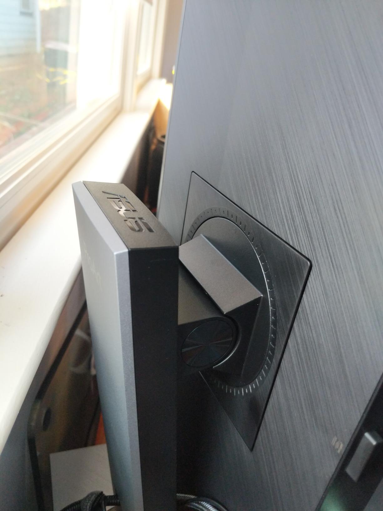
What you give up is resolution and modern connectivity. There is no USB-C, so a laptop means a dock or a separate cable run, and the USB hub includes USB 2.0 ports alongside USB 3.0. At 300 nits the panel is dimmer than every other option here, which constrains bright-room working.
Why a 16:10 panel still makes sense for design work
Most design tools are vertically stacked: layers, artboards, swatches, history. A taller panel shows more of that stack without shrinking the interface, so you spend less time scrolling, and pivot to portrait adds a genuine second orientation for long layouts and web page mockups.
Where 1920 x 1200 becomes the limit
Retouching at full pixel zoom on a 4K image is workable but cramped, and a 24 inch panel at this resolution does not pair well with a 4K laptop. If the machine feeding it is capable, the same budget stretched to a QHD or 4K panel usually buys more usable detail.
How to Choose a Color Calibrated Monitor
The single most common mistake is buying a wide gamut screen for sRGB-only work, or an sRGB screen and wondering why your brand colors look flat. Decide your output first, then read the spec sheet with that answer in mind.
Color gamut: which one you actually need
Color gamut is the range of colors a display can produce, and color space is the defined container of that range. sRGB is the web and UI standard, Adobe RGB covers most offset print and photography, DCI-P3 is the digital cinema standard now spreading to web video, and Rec. 709 is the broadcast video equivalent of sRGB. Web and UI designers need nothing beyond full sRGB. Print and prepress work needs Adobe RGB, and video editors need P3 or Rec. 709 coverage.
Delta E: the number that matters
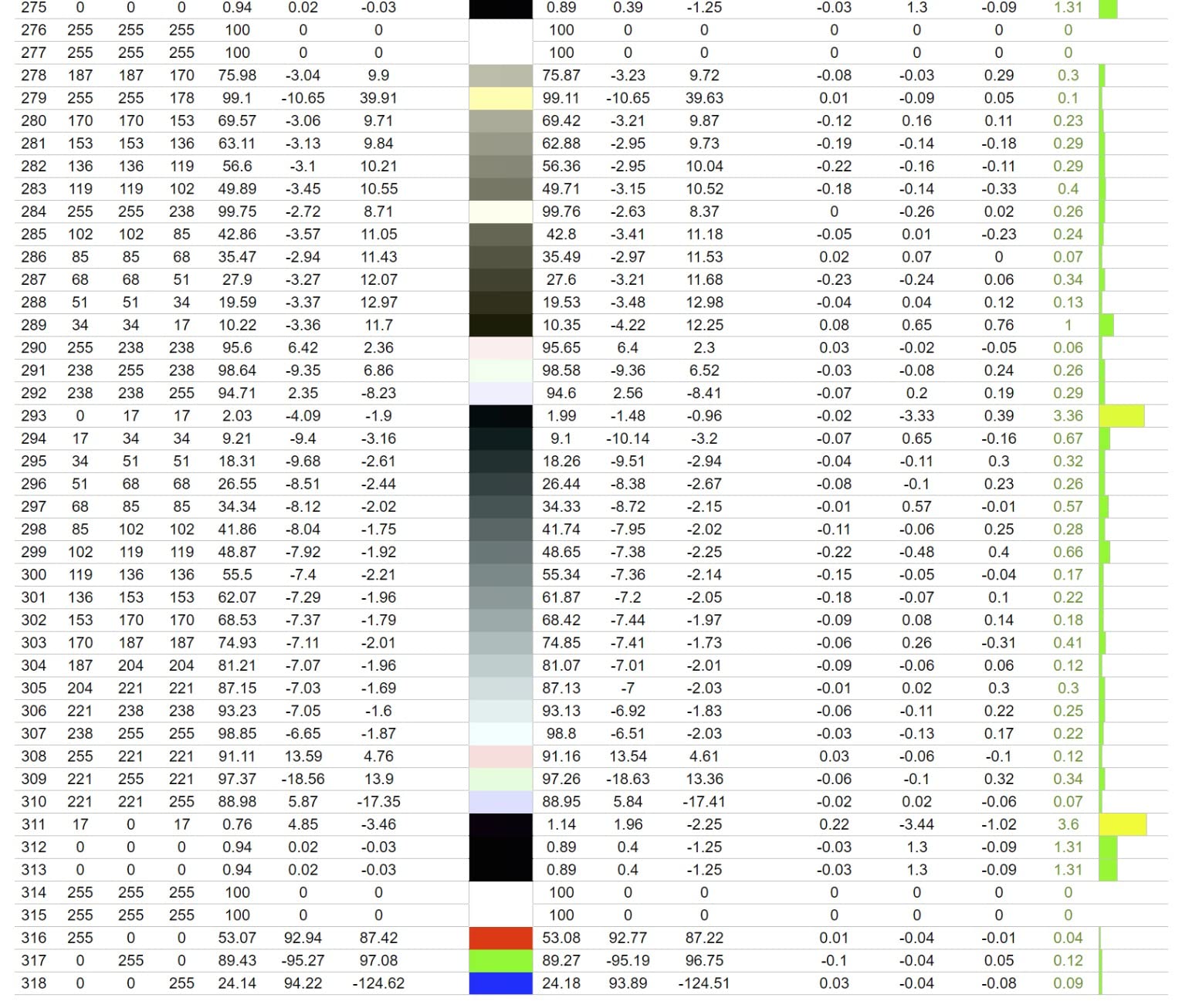
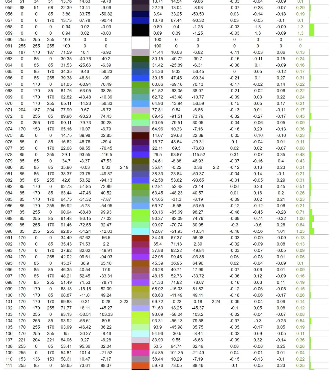
Delta E measures the distance between a color the panel shows and the color it should show, where a value of zero is a perfect match. Below 2 is the professional threshold, below 1.5 is exceptional, and a Delta E of 3 is acceptable for design work judged on screen. Note that Delta E is a distance, not a percentage, so lower is always better, and that a factory figure is an average rather than a guarantee for every color on the screen.
Factory calibrated vs hardware calibration
Factory calibrated means the manufacturer measured the panel and adjusted it before shipping, usually with a report in the box. Hardware calibration means the monitor can build and store its own correction tables in its internal 3D LUT, so the profile survives a computer or operating system change. Software calibration relies on the computer’s graphics driver instead, which is the least portable option. For most designers, factory calibration plus a personal colorimeter pass every few months is the practical answer.
Panel technology: IPS, IPS Black and OLED
Standard IPS is the workhorse for color accuracy with wide viewing angles and modest contrast. IPS Black panels, found in the Dell UltraSharp models here, roughly double native contrast. OLED and QD-OLED panels deliver perfect blacks and very wide gamut with per-pixel lighting, but they add burn-in risk for a static interface that a designer stares at all day, and none appeared in this roundup. VA panels give deeper blacks but shift color with viewing angle, and TN panels are simply not accurate enough for design work.
Resolution and size: the 27 inch sweet spot
27 inch at 2560 x 1440 gives about 109 pixels per inch, which keeps interface text legible and matches a dual-monitor 1440p setup neatly. 27 inch at 4K gives about 163 pixels per inch and is the sharpest option here, though it requires scaling for interface sizes to stay comfortable. 31.5 inch at 4K sits between the two and gives more physical workspace, which is why the Dell U3223QE appeals to retouchers working across two programs at once.
Brightness, room light and uniformity
Working brightness for color-critical editing usually lands between 120 and 160 nits matched to the room, while 350 to 450 cd/m2 panels give you headroom for a bright office or HDR work. Ambient light is the variable most guides ignore, and it matters more than any spec: a perfect calibration in a sunlit room is invalid within minutes. Look for matte or nano-texture coatings in bright spaces, and expect a glossy panel to be a liability outside a controlled room.
How to Actually Calibrate Your Monitor
No factory calibration report survives contact with a hot room, a new OS update, or a panel that aged. Calibrating takes twenty minutes, and doing it on a schedule is what separates a color calibrated monitor from a monitor that was accurate once.
The six step calibration workflow
First, warm the display for at least twenty minutes so the backlight and panel reach a stable operating temperature. Second, set brightness to the target for your room, usually 120 to 160 cd/m2 for print and photo work, and let it settle. Third, set the color space to the one you work in, sRGB for web, Adobe RGB for print, DCI-P3 for video, and disable any dynamic contrast, HDR or smart brightness features that will fight you.
Fourth, place the colorimeter flat against the center of the screen in its protective cover and run the reading. Fifth, write the ICC profile to the correct display and set your design application to use it rather than the monitor’s own profile. Sixth, verify the result with a test image such as a grayscale ramp, and save the reading so you can compare against it next month. Repeat the whole process monthly for print work, and more often if the room temperature changes a lot.
Choosing a colorimeter
There are three families worth considering, and the forum consensus is consistent about the trade-off. The DataColor SpyderX line calibrates quickly and is the friendliest to use. The Calibrite ColorChecker Display range produces a measurably more accurate profile and is the choice for print and prepress. The X-Rite i1Display line sits alongside both and is widely trusted for long-term profiling work. Whichever you pick, calibrate the device itself against its own reference chart before trusting it on your screen.
SpyderX vs Calibrite vs X-Rite
On speed, the SpyderX wins. On profile quality, Calibrite is generally reported as reaching a lower measured color error, and a mu-43 comparison found the same result. On software, all three produce standard ICC profiles that Photoshop, Lightroom and Affinity read without extra plugins, so the difference is measurement quality rather than file format. For a designer on a single display doing mostly web work, the faster and cheaper unit is genuinely enough.
How often to recalibrate and how to spot drift
Monthly is a reasonable cadence for print and grading work, quarterly for general design, and immediately whenever you move the monitor, change rooms, or notice a shift. Drift announces itself in predictable ways: shadows in Photoshop that look lifted compared to a week ago, a photo that suddenly looks over-warm, or a file that prints differently from the last run of the same job. A cheap visual test image loaded side by side with a known reference catches drift long before a client does.
Two things calibration cannot fix are worth stating plainly. It cannot widen the gamut, so saturated Adobe RGB colors on an sRGB panel stay clipped no matter how good the profile is. It cannot correct uniformity problems, so a panel with uneven backlight or a tint in one corner will still have that corner after you calibrate, which is the reason to test a display early in the return window.
Frequently Asked Questions
What monitor has the best color accuracy?
Among the monitors we reviewed, the ASUS ProArt PA278QV and PA248QV are factory calibrated to Delta E under 2 and Calman Verified, while the Dell UltraSharp U2725QE carries the tightest published spec at Delta E under 1.5. For wide gamut work, the ASUS ProArt PA279CRV covers 99% DCI-P3 and 99% Adobe RGB. A factory figure is an average, so calibrate your own unit before paid work.
What is the best colorimeter for monitor calibration?
There are three main families. DataColor SpyderX calibrates fastest and suits web and general design work. Calibrite ColorChecker Display produces a measurably more accurate profile and is the better choice for print and prepress. X-Rite i1Display is a comparable professional option. Whichever you buy, calibrate the device against its own reference chart first, and recalibrate your monitor monthly for print work.
Do I need to calibrate a factory-calibrated monitor?
Yes, ideally at least once. Factory calibration is an average taken before shipping, usually with a report in the box, and it drifts as the panel ages or the room changes. A personal colorimeter pass takes about twenty minutes and makes the factory spec your starting point rather than your ceiling. For web and UI work the factory calibration alone is usually adequate, for print and grading it is not.
What is the best 4K monitor for designers?
The Dell UltraSharp U2723QE is the most complete 4K workspace, with an IPS Black panel at 2000:1 contrast, factory Delta E under 2, USB-C at 90 watts, KVM switching and a built-in Ethernet port. The Dell UltraSharp U2725QE matches the accuracy with a tighter Delta E under 1.5 and adds 120 hertz and Thunderbolt 4, while the ASUS ProArt PA279CRV leads on wide gamut coverage at 99% DCI-P3 and 99% Adobe RGB.
What color gamut should designers use?
It depends on your output. Full sRGB is correct for web, UI and most brand work. Adobe RGB is the working space for print, prepress and most photography. DCI-P3 covers digital cinema and modern web video, and Rec. 709 is the broadcast standard. Buying a wide gamut screen does not let you use a wide gamut space for everything, because a file saved in Adobe RGB still looks different to someone viewing in sRGB.
The Verdict: Which Color Calibrated Monitor Should You Buy
The ASUS ProArt PA278QV is our pick for most designers, with a factory Delta E under 2, full sRGB and Rec. 709 coverage, a fully adjustable stand and the longest review history in the guide. If you need wide gamut for print or video, step up to the ASUS ProArt PA279CRV at 99% Adobe RGB and 99% DCI-P3, or the Dell UltraSharp U2725QE if you also want 120 hertz and Thunderbolt 4.
Budget is not a reason to give up accuracy. The ASUS ProArt PA248QV delivers a Calman Verified Delta E under 2 with a five year warranty for the least money here, and the ViewSonic ColorPro VP2756-4K adds Pantone Validated certification for brand work. Whichever you choose, buy a colorimeter, calibrate it monthly, and check the panel inside the return window. That last habit catches more bad displays than any spec sheet.
This guide was updated for 2026. Product specifications change with each firmware and hardware revision, so confirm the panel details on the manufacturer page before you commit to a print or grading workflow.