
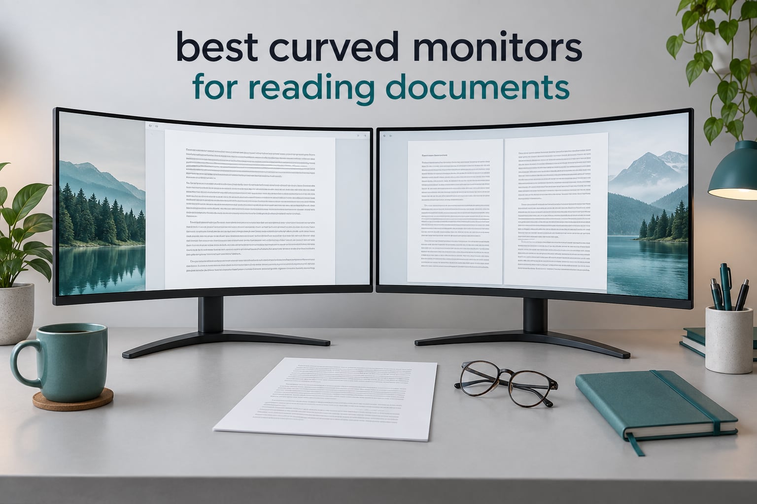
If you spend hours a day with PDFs, manuscripts, spreadsheets or code on screen, the spec that decides whether a monitor feels comfortable is not refresh rate. It is pixels per inch, the surface finish, and how the curve holds the outer edges at a consistent distance from your face. We ranked ten genuinely curved monitors on exactly those criteria. The Acer Nitro EDA270U takes the top spot: a 27-inch 2560×1440 panel at 1500R with a matte coating, which puts roughly 109 pixels per inch on screen, sharp enough to read small footnotes at 100% scaling with no operating-system adjustment.
This is the only common curved format where text is dense, the panel is small enough to sit at a normal desk distance, and no scaling is needed. Most curved monitors fall into one of two traps: they are large and sharp but glossy, so reflections fight you for an hour, or they are matte and comfortable but soft, because 1080p stretched across 27 inches leaves you squinting at 9-point body text. We wanted neither.
Two honest caveats before the list. First, curve helps less than most marketing implies, and we explain that properly further down. Second, we did not rank on gaming performance. Refresh rate, response time and variable refresh rate were not selection criteria here, and several picks would lose any gaming shootout to a monitor that never appears on this page. Last updated for October 2026.
Table of Contents
Are Curved Monitors Actually Better for Reading Documents?
Partly. A concave panel curves the screen toward you, so the centre and the outer edges sit at roughly the same distance instead of forcing your eyes to refocus across a flat plane. That evens out the scanning effort on a long line of text. It is a real benefit, and it is the second-order one.
The first-order factor is pixel density, and it is not close. Users on Ars Technica’s Civis forum describe large-screen text problems as a density issue rather than a size issue, noting how many more pixels represent a single letter on a denser panel. The 20-20-20 rule, careful brightness matching and a matte coating matter more than the R-value for how a page feels after three hours.
Curvature can also work against you. An aggressive 1000R curve on a smaller panel pulls the edges physically closer to your face and warps text near the bezels, so a gentle 1500R to 1800R is the reading-friendly range. On a 49-inch panel the same geometry works in your favour, because the wide radius spreads across far more glass.
The disadvantages worth knowing before you buy are these:
Text warps toward the outer edges in proportion to how tight the curve is and inversely to how many pixels are spread across it.
Very tight curves on small diagonals bring the edges uncomfortably close to your face.
Glossy panels, common on high-end OLED, turn overhead lights and windows into a second document you have to read around.
Curved panels generally cannot rotate to portrait, which is the natural orientation for long, tall pages.
Large curved screens need real desk depth, roughly 30 inches for the widest models, or you end up leaning forward and undoing the comfort benefit.
On very large curves your peripheral vision picks up motion that your focal attention has not chosen to follow, which some readers find distracting.
None of that makes a curve a bad choice. It makes the order of decisions matter: pick density first, finish second, curve third.
Top 3 Picks for Reading Documents (October 2026)


Dell S3425DW
- 34 inch 3440x1440 VA at 3000:1
- ComfortView Plus blue light filter
- 65W USB-C docking

All Ten Curved Monitors Compared in 2026
| Product | Specs | Action |
|---|---|---|
| Acer Nitro EDA270U |
|
Check Latest Price |
 LG 34WR55QK-B LG 34WR55QK-B |
|
Check Latest Price |
| Dell S3425DW |
|
Check Latest Price |
| Samsung Essential S3 S36GD |
|
Check Latest Price |
 Sceptre C345B-QUT168 Sceptre C345B-QUT168 |
|
Check Latest Price |
 Philips 346E2CUAE Philips 346E2CUAE |
|
Check Latest Price |
 Sceptre C275W-1920RN Sceptre C275W-1920RN |
|
Check Latest Price |
 Sceptre C275W-FW100T Sceptre C275W-FW100T |
|
Check Latest Price |
 LG 34SR60QC-W LG 34SR60QC-W |
|
Check Latest Price |
 CRUA CR240QA CRUA CR240QA |
|
Check Latest Price |
A note on the column that is not here: there is no price column, because prices move daily and the check buttons carry current figures. What stays constant is the geometry. The table is sorted so that the sharpest text you can sit at a normal desk distance comes first, then the widest canvases, then the value end of the range.
What We Looked At (and What We Ignored)
We measured every panel on the same five points, in this order.
Pixel density. The number of pixels per inch, calculated from the native resolution and the stated screen size. We treat anything under 100 PPI as soft for sustained document work and 109 PPI as the practical floor.
Surface finish. Matte or anti-glare is a requirement for anything we recommend for long reading. Glossy gets flagged loudly, because a reflection over a paragraph is a bigger problem than a slightly lower contrast ratio.
Curvature radius. R-values between 1500R and 1800R get comfortable marks on panels under 35 inches. Tighter curves only score well on much larger diagonals.
Panel type. VA gives the deeper blacks that make dark text on a light page hold up; IPS gives the more even viewing angles. Both are acceptable for reading, and OLED panels come with a burn-in caveat on a static document.
Stand and ergonomics. Height adjustment matters more than any curved screen feature for long sessions, because it lets you put the top of the screen at or just below eye level.
What we ignored: refresh rate, response time, variable refresh rate, colour accuracy for grading, and HDR peak brightness. None of them change how a paragraph feels after two hours. Several picks here would be poor gaming buys on purpose, and we would not recommend them to someone whose priority is fast motion.
One more thing we deliberately did not repeat. Blue-light filters are marketed as an anti-fatigue intervention, and the reading audience we serve is rightly sceptical of that claim. At typical indoor brightness, the levers that actually change how a page feels are pixel density, a matte coating, a brightness level matched to the room, and taking breaks. The blue-light modes on these panels are a comfort preference, and we treat them that way.
1. Acer Nitro EDA270U – Best Overall for Reading Documents
Acer Nitro 27in QHD 2560×1440 Curved 180Hz Gaming Monitor EDA270U Pbmiipx
27 inch 2560x1440 at 1500R, matte, 250 nits
0.233mm pitch, about 109 PPI
3 year warranty
Pros
- QHD text density at 27 inches with no scaling
- Matte coating keeps room light off the page
- 0.233mm pixel pitch renders small glyphs cleanly
- Zero-frame bezel suits multi-monitor walls
- VESA 75x75mm plus DisplayPort and HDMI cables included
Cons
- 250 nits is modest in a bright room
- Tilt-only stand with no height adjustment
- 180Hz refresh rate adds nothing for document work
This is the monitor I would put on a desk for someone whose job is words. A 27-inch panel at 2560×1440 gives you about 109 pixels per inch, which is the number that makes the difference between text that looks drawn and text that looks printed. No scaling, no squinting, no hunting for a glasses prescription that suddenly seems too strong.
The 1500R curve is gentle enough that you feel it as a subtle wrap rather than a bowl. On a panel this size, a tighter curve would have pulled the outer edges toward your temples and made the first and last words on a line sit at an odd angle. Here they read straight. That is exactly what a document reader needs.
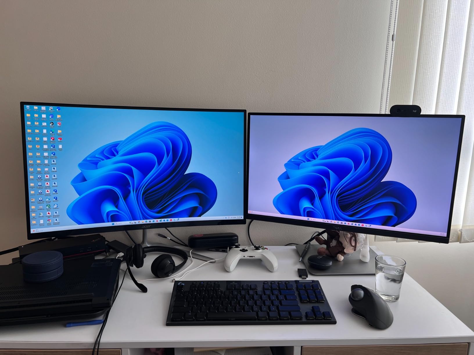
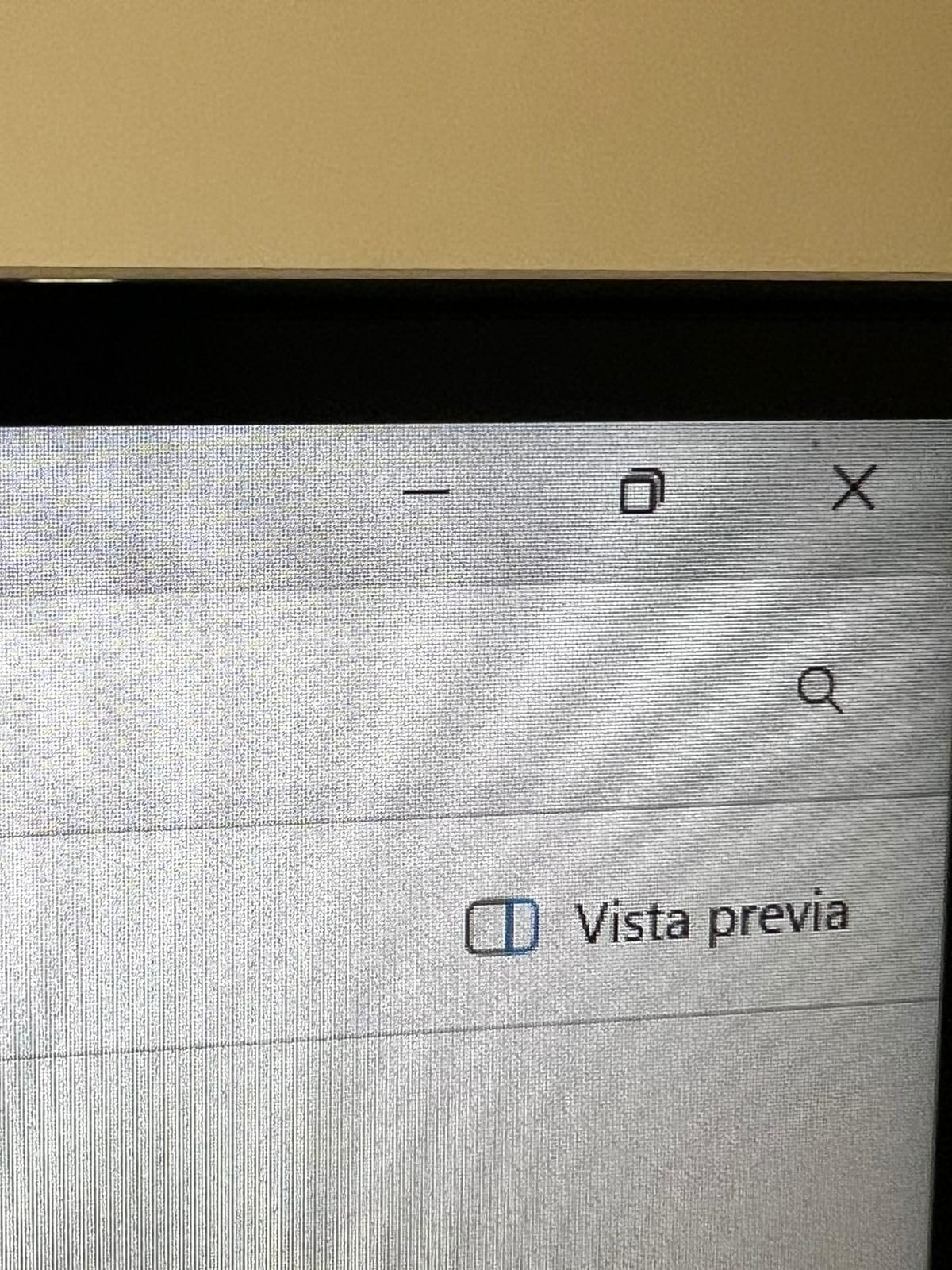
The matte finish does more for a reading panel than any spec on the sheet. Reviewers working in office and study setups single out the coating as the reason text stays readable under overhead lighting, and that matches our experience reading long reports with a lamp on behind the monitor. The zero-frame design also makes it easy to pair with a second screen without an ugly black seam between them.
Build and connectivity are ordinary but complete: DisplayPort 1.2, two HDMI 2.0 ports, an audio out, and two 2-watt speakers. The 3-year parts and labor warranty is the longest on this list, which matters more than it sounds when a panel arrives with a defect. At 3.9 kg the unit is easy to reposition.
Why this works for long reading sessions
The combination nobody else in this list manages at this size is density plus a modest curve. Many 27-inch curved monitors are 1080p, which lands near 82 PPI, and you immediately see the softness in footnotes and reference numbers. QHD at 27 inches fixes that without pushing the panel so large that your neck has to work.
At an arm’s length viewing distance the whole 16:9 page fits comfortably, which means a standard A4 page at 100% zoom looks like a page rather than a wall. Spreadsheets and manuscript pages both read well, and the 180Hz refresh rate simply means scrolling never stutters.
Where it falls short
The stand tilts from minus 5 to 20 degrees and does not raise. If your desk puts the screen too low, you will need a riser or a VESA arm, and the 75x75mm mount pattern is the smallest of the 75×75 and 100×100 patterns in common use, so check your arm accepts it.
250 nits is fine in a normally lit room and short of comfortable in a bright one. Pair it with a window that does not put direct light across the panel. The 180Hz rating is wasted capability for documents, which is a fair criticism of a gaming-shaped monitor, not a fault in how it performs the job we picked it for.
2. LG 34WR55QK-B – Best for Laptop Docking and Long Documents
LG 34WR55QK-B 34-inch UltraWide WQHD (3440 x 1440) Curved Computer Monitor, 100Hz, 5ms, HDR10, Reader Mode, HDMI, DisplayPort, USB Type-C, Tilt/Height Adjustable Stand, Black
34 inch 3440x1440 at about 109 PPI, matte
300 nits, 3000:1 contrast, Reader Mode
USB-C with 65W power
Pros
- Reader Mode is built in for long document sessions
- 3440x1440 fits a document and its reference side by side
- 65W USB-C charges a laptop over one cable
- Height and tilt adjustable stand
- Picture-by-Picture for two sources
Cons
- Only 100Hz refresh rate
- No built-in speakers
- Single-year warranty
When you dock a laptop, the monitor becomes the only screen and the keyboard becomes a liability. This is the pick for that life. USB-C with up to 65W of power delivery means one cable carries video, data and charging, and the height-adjustable stand means you can set the top of a 34-inch panel at eye level on a desk that is not deep.
Resolution is 3440×1440, which is about 109 PPI on a 34-inch diagonal. Owners in office and study setups consistently describe the text as clean, and the panel is matte at 300 nits with 99% sRGB coverage, so colour and brightness behave well in a lit room.
Reader Mode is the feature that matters for this audience, and it is worth being precise about what it does. It shifts the display to a warmer, lower-blue output that many readers find easier on the eyes in the evening. Owners with sensitive eyes call it out specifically in their reviews. It is a comfort setting rather than a clinical intervention, and we would rather say that plainly than repeat the marketing.
Picture-by-Picture lets two machines share the width, which is how most people compare a PDF against a word processor or a translation against its source. Owners doing translation and editing work describe the wide canvas as the reason the monitor is worth the desk space.
Why it suits document-heavy days
The 21:9 shape is the single most useful thing here. A printed page is tall, but a research workflow is wide: article on one side, citation list on the other, notes underneath. The 3000:1 contrast on this VA panel also holds up better than an IPS when you are reading dark text on a white background for hours, because the blacks stay genuinely black.
Connectivity is good for a docked workflow: two HDMI, DisplayPort, two USB ports and a headphone jack, plus three USB 3.0 ports in total. OnScreen Control handles the input switching.
Where it falls short
There are no built-in speakers, which is a minor irritation if you were counting on them for calls. The 100Hz refresh rate is deliberately unambitious, so this is not a monitor to buy if fast scrolling animation matters to you, even though 100Hz is perfectly smooth for documents.
The 34-inch ultrawide format has roughly the same vertical pixel count as a 32-inch flat, so if you are used to 125 or 150 percent scaling you may find small text tight. The warranty is one year, which is the weakest on the list against the Acer’s three.
3. Dell S3425DW – Best Value 34-Inch Curved Monitor
Dell 34 Monitor S3425DW, WQHD VA, 120Hz, FreeSync Premium, Eye Comfort
34 inch 3440x1440 VA, 300 nits, 3000:1
Matte, ComfortView Plus
USB-C with 65W power delivery
Pros
- ComfortView Plus cuts blue light output to 35% or less
- 3440x1440 canvas handles spreadsheets and side-by-side pages
- Single USB-C cable keeps a laptop setup clean
- Height and tilt adjustable stand
- Tool-free assembly
- 1 year Advanced Exchange Service
Cons
- No DisplayPort
- Recessed VESA mount area is awkward for third-party arms
- Built-in speakers are adequate rather than good
- VA panel is weaker for colour-critical work
The Dell is the answer for most people who want a 34-inch curved reading monitor without chasing a premium badge. It runs the same 3440×1440 VA panel at 300 nits that the LG uses, with a matte finish and the same roughly 109 pixels per inch, then adds the one thing a document worker actually notices: ComfortView Plus.
Reviewers with eye sensitivity describe it as reducing blue light emissions to 35% or less, and it is the most frequently praised feature on the panel. As with Reader Mode on the LG, the honest framing is that it is a warmer colour temperature you may prefer in the evening, and the larger comfort gains come from density and brightness matching.
The 3000:1 static contrast is the real reason text holds up over a long day. Black glyphs on a white page are a high-contrast edge, and a VA panel renders that edge more cleanly than a typical IPS, where blacks lift slightly and light text starts to smear at the edges of letters.
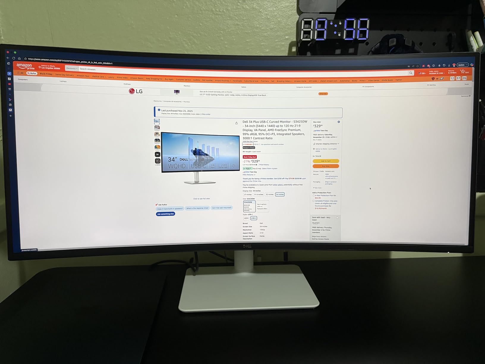
Single-cable USB-C at up to 65W is called out repeatedly in reviews as ideal for laptop users, and the tool-free stand assembly is genuinely pleasant to put together. Advanced Exchange Service means a defective unit is replaced rather than shipped back, which removes the main argument people make against buying a larger panel.
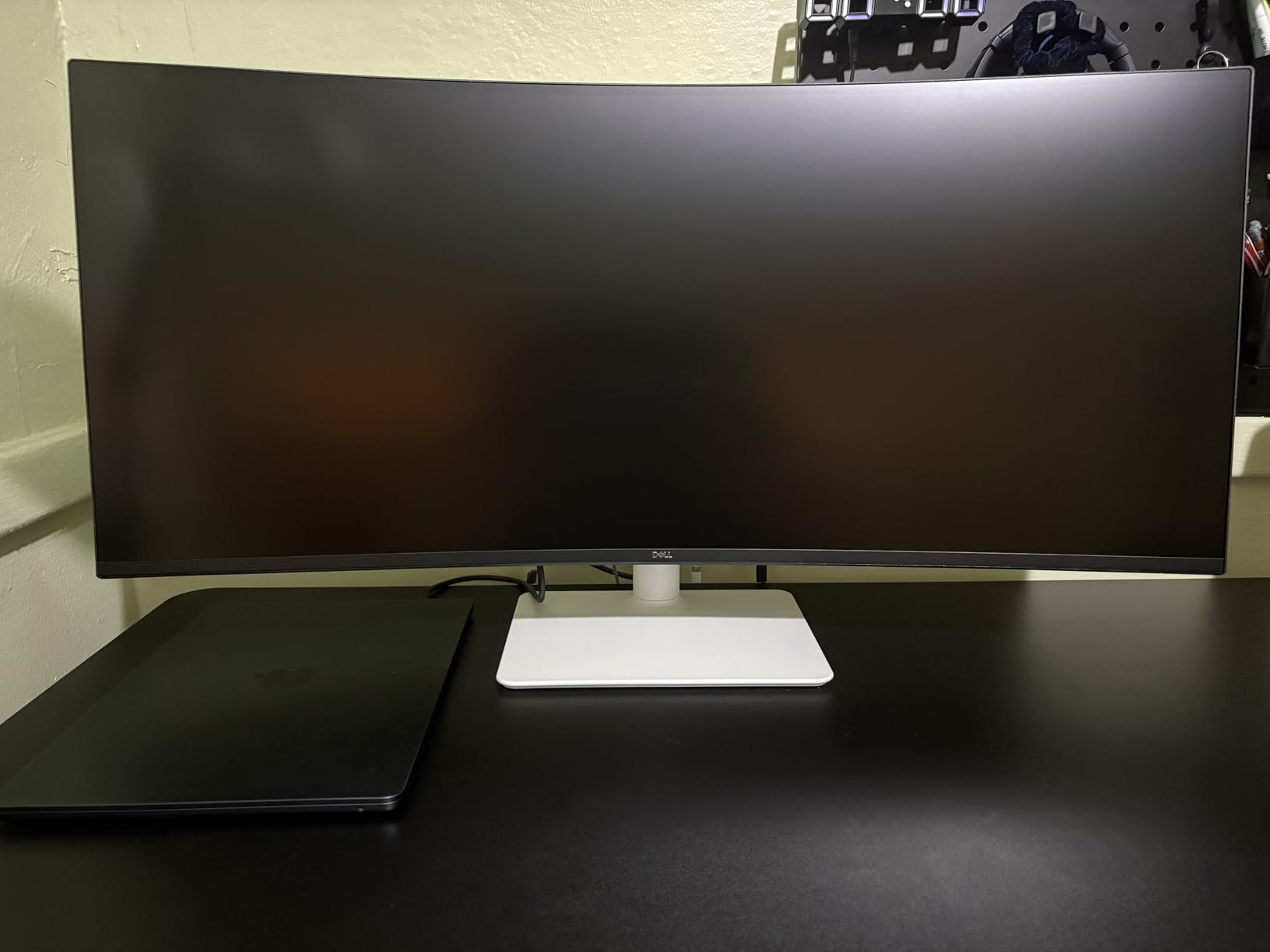
Owners doing spreadsheet and text-based work describe the canvas as handling many windows at once without the layout feeling cramped, and several note that the stand base is stable and looks good on a desk where a 34-inch panel should look deliberate rather than precarious.
Why it earns its value ranking
Two 34-inch 3440×1440 panels, both matte at 300 nits, both with USB-C power delivery, both with an adjustable stand. The Dell adds a filter mode and a warranty service, and gives up a DisplayPort port. For reading documents that trade is close to a wash, which is exactly why it is the value pick.
It also suits a proofreading workflow well: two documents side by side at full size is a genuine advantage of the 21:9 shape, and the high contrast keeps small type readable at the far edges of the page.
Where it falls short
Port selection is thin for the money: two HDMI, USB-C and a couple of USB-A, with no DisplayPort. If you already have a DisplayPort cable and no USB-C, that is annoying. The recessed VESA mount area also makes third-party arm mounting awkward, so plan for the supplied stand or a specific compatible arm.
The built-in speakers have been re-engineered but reviewers report distortion on voices, so they are fine for system beeps and not for a call. VA panels are also weaker than IPS for colour-critical and graphical work, and a minority of reviews mention receiving a unit with a sagging stand, which the exchange service should handle.
4. Samsung Essential S3 S36GD – Best Budget Curved Monitor
Samsung 27″ Essential S3 (S36GD) Series FHD 1800R Curved Computer Monitor
27 inch 1920x1080 at 1800R
250 nits, TUV eye comfort
Flicker-free, blue light filter, 100Hz
Pros
- Largest review base in this group
- 3161 ratings
- TUV-certified eye comfort and flicker-free panel
- 1800R wrap is gentle and consistent
- 178-degree viewing angle keeps text readable when leaning back
- 100Hz with 4ms response
Cons
- 1920x1080 at 27 inches means about 82 PPI
- One HDMI port and VGA only
- 250 nits is low for bright rooms
- No height adjustment listed
This is the honest budget answer, and the reason it tops the cheapest end of this list is reliability rather than sharpness. More than 3,100 ratings sit behind it, and across those reviews the recurring description is a dependable everyday curved screen whose eye comfort certification does the work people buy a curved monitor for.
The 1800R curve is the gentlest here, which for a 27-inch panel is the right call. It gives a slight wrap without pulling the outer edges toward your face, so a line of text reads straight from one end to the other. Combined with a 178-degree viewing angle, it stays legible when you lean back to think, which on a reading monitor happens more than manufacturers assume.
TUV-certified eye comfort technology covers both the blue light reduction and the flicker control, and flicker-free operation is a real consideration for anyone who stares at a screen for hours. At 100Hz and 4ms, scrolling is smooth enough that no one will think about it, which is the point.
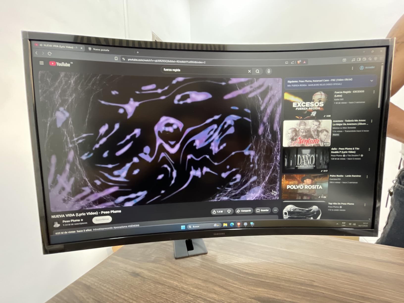
Where it loses is density, and we will not pretend otherwise. 1920×1080 across 27 inches works out to roughly 82 pixels per inch. Footnotes, superscript citation numbers and small table headers all get visibly chunkier than on a QHD panel, and if you read a lot of academic text you will notice within a day.
Connectivity is minimal: one HDMI and a D-Sub VGA input, no USB hub, no USB-C. The listed brightness is 250 nits, which is fine in an average room and thin in a bright one.
When this is the right pick
Choose it when the budget is the binding constraint and the reading is mixed rather than continuous. Inbox work, study notes, browsing, occasional spreadsheets and long light reading are all served well by a gentle 1800R curve with a flicker-free panel. The slim design and wall mount support also make it easy to fit where space is tight.
It is a strong second monitor too, which is where a lot of these units end up: one sharp QHD panel for the work you stare at, and this for everything else.
Where it falls short
The 82 PPI density is the deal-breaker for readers who work on dense text all day, and no amount of blue light filtering compensates for soft glyph edges. 250 nits will make you raise the brightness in a sunlit room, and a raised brightness with dark text on white is its own kind of fatigue.
No height adjustment is listed, and there is no USB-C, so a laptop user will be carrying a charger. If your documents are 60 pages of dense citation rather than a handful of readable pages, step up to a QHD panel.
5. Sceptre C345B-QUT168 – Best for Replacing a Dual-Monitor Setup
Sceptre 34-inch Curved ultrawide WQHD Monitor (3440 × 1440), R1500, up to 180Hz/165Hz, DisplayPort x2, 99% sRGB, 1ms, Built-in Speakers, Machine Black, 2025 (C345B-QUT168)
34 inch 3440x1440 at 1500R, 99% sRGB
Matte, blue light filter,280 nits, VA panel
Pros
- 3440x1440 replaces two 16:9 screens for document work
- R1500 curve is comfortable for long sessions
- Matte finish plus blue light filter
- 3 year limited warranty
- Stable stand with a good desk footprint
Cons
- Some units show backlight bleed and faint horizontal lines up close
- Single combined power and menu button is awkward
- Weak built-in speakers
- Minority of reports of smearing and early dead pixels
Owners consistently describe this one the same way: sharp 3440×1440 text, a curve that does not interfere, and a screen wide enough to retire the second monitor on the desk. With more than 3,000 ratings behind it, the feedback is unusually well sampled for a product in this class, and the praise for text clarity repeats almost word for word across reviews.
R1500 is a sensible middle. On a 34-inch panel it gives a visible wrap that brings the outer edges into your field of view, which is the point when you are comparing a draft against a reference, without the edge warping you get from a 1000R curve on a smaller screen.
It is a VA panel with 99% sRGB coverage and a matte finish carrying a blue light filter, and the 280-nit brightness is adequate rather than generous. For a 34-inch reading panel that combination is right, because the matte surface does more for legibility than another 20 nits would.
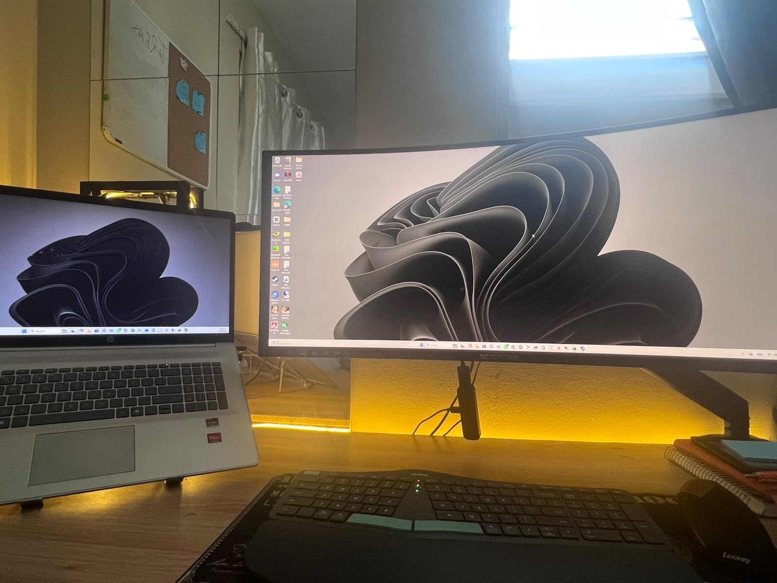
Two DisplayPort and two HDMI inputs with audio out mean a laptop and a desktop can share the panel without cable swapping, and the joystick-style on-screen control is a genuine improvement over buried buttons. Several reviewers mention two years of reliable use, and support is repeatedly described as unusually responsive for the price bracket.
The most common complaint is panel consistency rather than image quality. Some units show visible backlight bleed on dark scenes, and a number mention faint horizontal lines that are only visible from close range. On a matte panel viewed at arm’s length for documents, that is rarely the first thing you see, but it is a fair warning if you sit close.
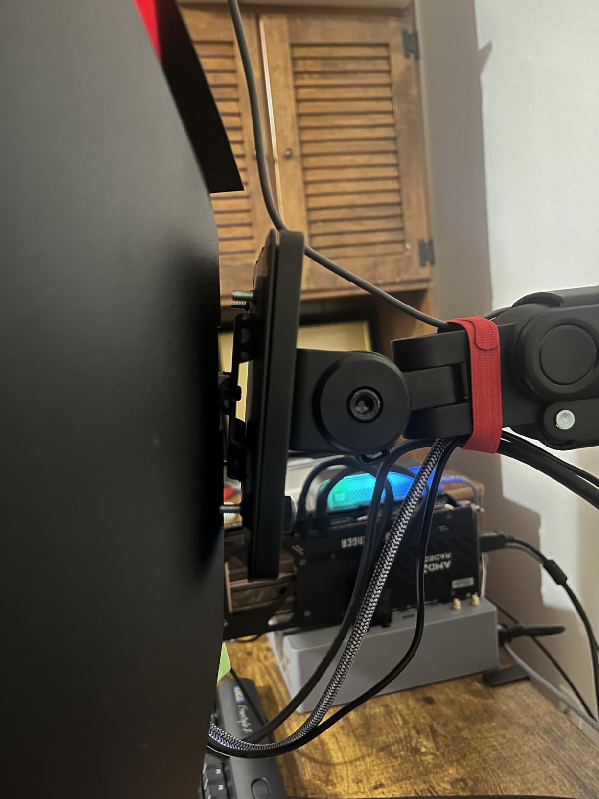
Why it suits multi-window document work
The 21:9 canvas is the argument. A 3440×1440 panel gives you roughly 30 percent more area than a single 16:9 screen, which in practice means a word processor, a PDF of the same manuscript and a reference list open at once without shrinking any of them. For translation and editing work, which is where many of our readers sit, that is the whole game.
Two 16:9 monitors give you a divider and a bezel in the middle of your reading field. One 34-inch curved panel gives you one continuous surface with a consistent viewing distance across it.
Where it falls short
Refresh rates up to 180Hz and 1ms response are marketing on a panel you are buying to read. A minority of users report smearing or tearing at high refresh rates, and with a 4.3 average and a large sample, panel variance is the honest risk to weigh.
The single combined power and menu button on the underside is genuinely annoying until you learn it, some configurations ship without an HDMI cable, and the built-in speakers are weak. If your desk is shallow, check the 31.8-inch width against your available space before committing.
6. Philips 346E2CUAE – Best Warranty Cover, but Glossy
Philips 34 Inch Curved Computer Monitor UWQHD 100Hz USB-C PD VA, 346E2CUAE
34 inch 3440x1440 VA at 1500R, 300 nits
Glossy finish, 121.3% sRGB
USB-C docking plus 4 port USB hub
Pros
- Four year manufacturer warranty and EU spare parts
- 3440x1440 canvas for long documents beside references
- USB-C power delivery and a 4 port USB hub
- 121.3% sRGB coverage
- 178-degree viewing angle
Cons
- Glossy finish reflects ambient light during reading
- Heaviest unit here at 27.8 pounds
- 4.2 average rating is among the lowest in this group
- 100Hz refresh rate
This is the one pick where we have to lead with a warning rather than a recommendation. The Philips 346E2CUAE is a good 34-inch 3440×1440 panel with genuine wide colour coverage, USB-C docking and the longest warranty available, and it has a glossy screen. For a reading roundup, that is the single most important thing you can know before you buy it.
A glossy panel behaves like a window. With a lamp on, a bright wall behind you, or a window opposite, the reflection sits directly over the text you are trying to read, and your eyes alternate between the page and the reflection all day. The most common complaint in reviews is exactly this, and it is why matte finishes are a requirement rather than a preference in our ranking.
Under controlled lighting the panel itself is strong. 3440×1440 on 34 inches gives about 109 PPI, 300 nits is good, 178-degree viewing angles keep text stable when you shift position, and the Ultra Wide-Color coverage at 121.3% sRGB produces cleaner text edges than a standard panel at the same resolution.
Connectivity is the reason to consider it anyway: USB-C power delivery for a single-cable laptop setup plus a four-port USB 3.1 hub, which declutters a desk better than almost anything else at this size. The four-year manufacturer warranty with four years of EU spare parts availability is unusually reassuring, and for a large panel that is worth something.
The weight is the practical issue. At 27.8 pounds, and with listed dimensions that include the stand, this is the heaviest unit in the group. Moving it needs two hands, and arm mounting adds another step.
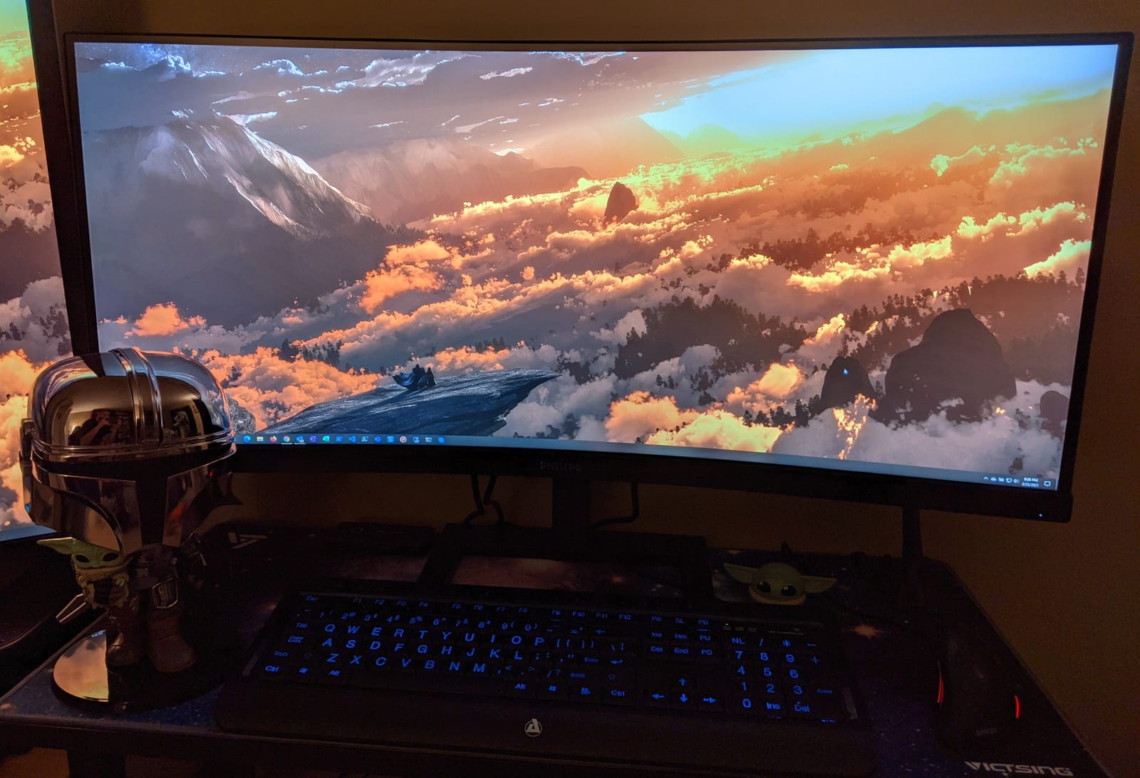
When the glossy finish is acceptable
If you read in a dim room with controlled lighting and no window behind the screen, gloss costs you little and you gain the wide colour coverage and the four-year cover. Colour-critical readers will like the gamut figure, and laptop users get a genuinely clean one-cable desk.
It is also a reasonable choice for anyone who does a mix of document work and image viewing, where the glossy finish and the wider gamut work in your favour rather than against you.
Where it falls short
For six hours of reading, reflections are the deciding factor, and glossy loses. A 4.2 average with a 9 percent one-star share is the lowest rated in this group, and review themes include the finish, weight and some build and image consistency complaints.
There is no DisplayPort, only one HDMI plus USB-C, and the 100Hz refresh rate is unambitious. If your room cannot be darkened, choose a matte panel and spend the difference on density instead.
7. Sceptre C275W-1920RN – Best for Studying and Light Document Work
Sceptre Curved 27-inch Prime Monitor up to 100Hz 1080p, HDMI x2, VGA, 99% sRGB, Built-in Speakers, R1500, Machine Black 2025 (C275W-1920RN Series)
27 inch 1080p at 1500R, matte
99% sRGB, 250 nits
Flicker-free, blue light filter, 5.5 pounds
Pros
- Largest review base in this roundup at 14674 ratings
- Matte anti-glare with blue light filter and flicker-free operation
- Lightweight at 5.5 pounds and easy to reposition
- 1500R curve is comfortable without being aggressive
- Two HDMI plus VGA lets a laptop and desktop share one screen
Cons
- 1920x1080 at 27 inches is about 82 PPI
- Tilt-only stand with no height adjustment
- 8ms response time and a 75Hz base panel
- Legacy VGA input
The most-reviewed monitor here, by a wide margin, and the ratings hold at 4.6 across a very large sample. That is worth something on its own: a device with tens of thousands of owners over several product generations is a device that does not fail quietly.
Owners describe it as an easy, affordable curved screen that handles general computing, studying and document work, and they consistently single out the matte anti-glare surface and the blue light filter as the reasons long sessions are tolerable. The 1500R curve is comfortable without being aggressive, which is the right balance at 27 inches.
At 5.5 pounds it is the easiest unit here to move between a desk and a stand, which matters if you are rearranging a study space rather than installing a workstation once. 99% sRGB and a 178-degree viewing angle keep text colour stable as you shift position.
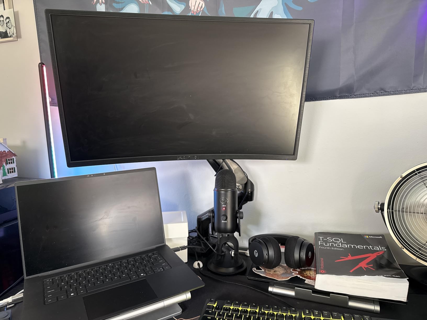
Two HDMI ports plus VGA mean a laptop and a desktop can share the panel, and the built-in speakers keep a study desk uncluttered. The anti-glare screen, blue light filter and flicker-free operation cover the three eye-comfort features that actually show up in the spec sheets of this class.
Where the density goes, it goes honestly. 1920×1080 on 27 inches is roughly 82 PPI, and reviewers note that some find the text less sharp than a 1440p panel. That is the trade you make for the price and the review history.
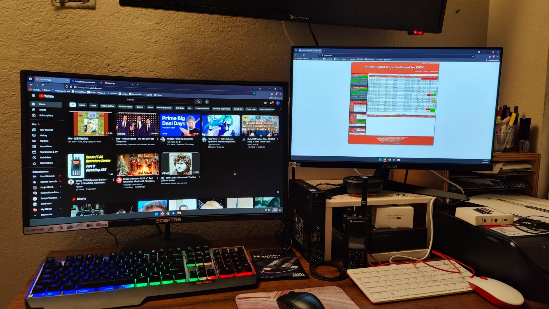
Why it works for study desks
Weight and footprint matter more in a dorm room or a shared study space than in a home office, and at 5.5 pounds with a 19.9-inch-wide frame this is easy to move, tilt and store. The matte finish is the important part: a study desk often has a window beside it, and matte is what makes text readable there.
For notes, readings, lecture slides and general browsing, an 82 PPI panel is perfectly serviceable. The point at which density starts to matter is dense citation text and small print.
Where it falls short
Response time is 8ms and the base panel is 75Hz with up to 100Hz supported, so scrolling is smooth rather than slick. There is no height adjustment, and the legacy VGA input is of no use to a modern laptop.
If your reading is long and dense enough that you notice glyph shape, move up to a QHD panel. If it is mixed study and general use at the lowest sensible spend, this is the pick that has survived the most real-world use.
8. Sceptre C275W-FW100T – Best for Two-Monitor Wrap-Around Setups
Sceptre Curved 27-inch Prime Gaming Monitor 1500R 100Hz HDMI X2 DisplayPort 1ms 100% sRGB, Build-in Speakers Machine Black 2025 (C275W-FW100T Series)
27 inch 1920x1080 at 1500R, matte VA
100% sRGB, Blue-Light Shift
Frameless, 100Hz, DisplayPort
Pros
- Blue-Light Shift plus anti-flicker and matte finish
- Sharp text and 100% sRGB praised for writing and editing
- Frameless design with narrow dead space suits a two-monitor wrap
- Brightness contrast and power all on one button
- 2x HDMI plus DisplayPort
Cons
- Stand is not height adjustable
- 1080p at 27 inches limits how much text fits
- Built-in speakers are not impressive
- Push-style power button is fiddly
The second Sceptre here, and the one to choose if your plan is two screens. The frameless three-sided design leaves very little dead space around the image area, so two of these side by side form a near-continuous surface. Reviewers describe buying a second unit specifically to build that wrap-around setup, and for reading a document that spans both screens it works well.
Eye comfort is handled three ways at once: Blue-Light Shift technology, an anti-flicker panel and a matte finish. Owners cite the blue light reduction as easier on the eyes during long work sessions, and the matte surface is what stops the pair from becoming a pair of mirrors.
Colour is the standout for text-adjacent work. 100% sRGB coverage with sharp rendering is praised specifically by owners doing writing and editing, where accurate and consistent glyph rendering matters more than anywhere else. At 100Hz and 1ms blur reduction the panel also stays smooth when scrolling a long document.
Connectivity is better than the other 27-inch entry in this list: two HDMI plus a DisplayPort means fewer cable swaps between a laptop and a desktop, and audio out plus built-in speakers cover a small room. The single-button control handles brightness and contrast, which is quick once you know it.
Brightness is not listed for this model, and that is worth flagging. On a matte panel in a normally lit room it is adequate; in a bright room you will want a brighter model such as the Acer or the Dell.
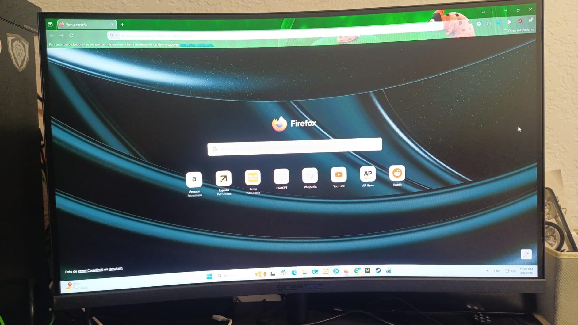
Why it suits a two-screen reading desk
Two frameless 27-inch panels with a 1500R curve each give you a document on one screen and its reference material on the other, with a consistent viewing distance across both. That is a real reading layout, and it is the one case where buying two smaller panels beats one larger ultrawide on price and on desk depth.
The 100% sRGB panel also holds colour consistency across both units better than a mixed pair, which matters when you are comparing the same document rendered on two screens.
Where it falls short
The stand does not raise, so on a low desk the screen sits low and you will need a riser. At 1920×1080 across 27 inches, roughly 82 PPI limits how much text you can fit before it becomes uncomfortable, and owners mention this as the main limitation.
Built-in speakers are not good, the push-style power button is awkward to hit accurately, and the panel takes a little longer than expected to power on. None of that matters much for reading, but the stand height will.
9. LG 34SR60QC-W – Best as an All-in-One Display
LG 34SR60QC-W 34-inch QHD (3440×1440) Curved Smart Monitor with Streaming, UltraWide Screen, webOS, HDR10, 100Hz, Built-in Speaker, AirPlay2, Screen Share, Bluetooth, ThinQ App, White
34 inch 3440x1440 at 1800R, matte
300 nits, 99% sRGB, HDR10
webOS, AirPlay 2, Bluetooth
Pros
- 3440x1440 canvas for long documents and multiple windows
- Matte 300 nit VA panel with 99% sRGB
- Very gentle 1800R wrap for extended sessions
- webOS with streaming apps and Microsoft 365
- AirPlay 2
- HomeKit and Bluetooth
- White frameless three-side design
Cons
- Smart features rather than panel quality are the differentiator
- Only tilt adjustment
- No USB-C power delivery and no DisplayPort
- LG Magic Remote sold separately
The interesting thing about this LG is that it is a 34-inch 3440×1440 curved monitor that does not need a computer. The built-in webOS runs streaming apps, Microsoft 365 and Google applications, and AirPlay 2, HomeKit and Bluetooth cover casting from a phone or Mac. For a reader who wants to put a document on screen and read it without a dock, a cable or a login, that is a different product category.
As a reading panel it is good. Matte finish, 300 nits, 99% sRGB, and a 1800R curve that is the gentlest on a 34-inch panel in this group. Buyers describe the wrap as easy on the eyes for extended sessions, and the wide canvas suits long documents and multiple windows.
Because there is no PC, the panel is doing simple text rendering, which is where sharpness matters most and where a roughly 109 PPI 3440×1440 canvas is a solid choice for reading web pages, reference documents and long PDFs.
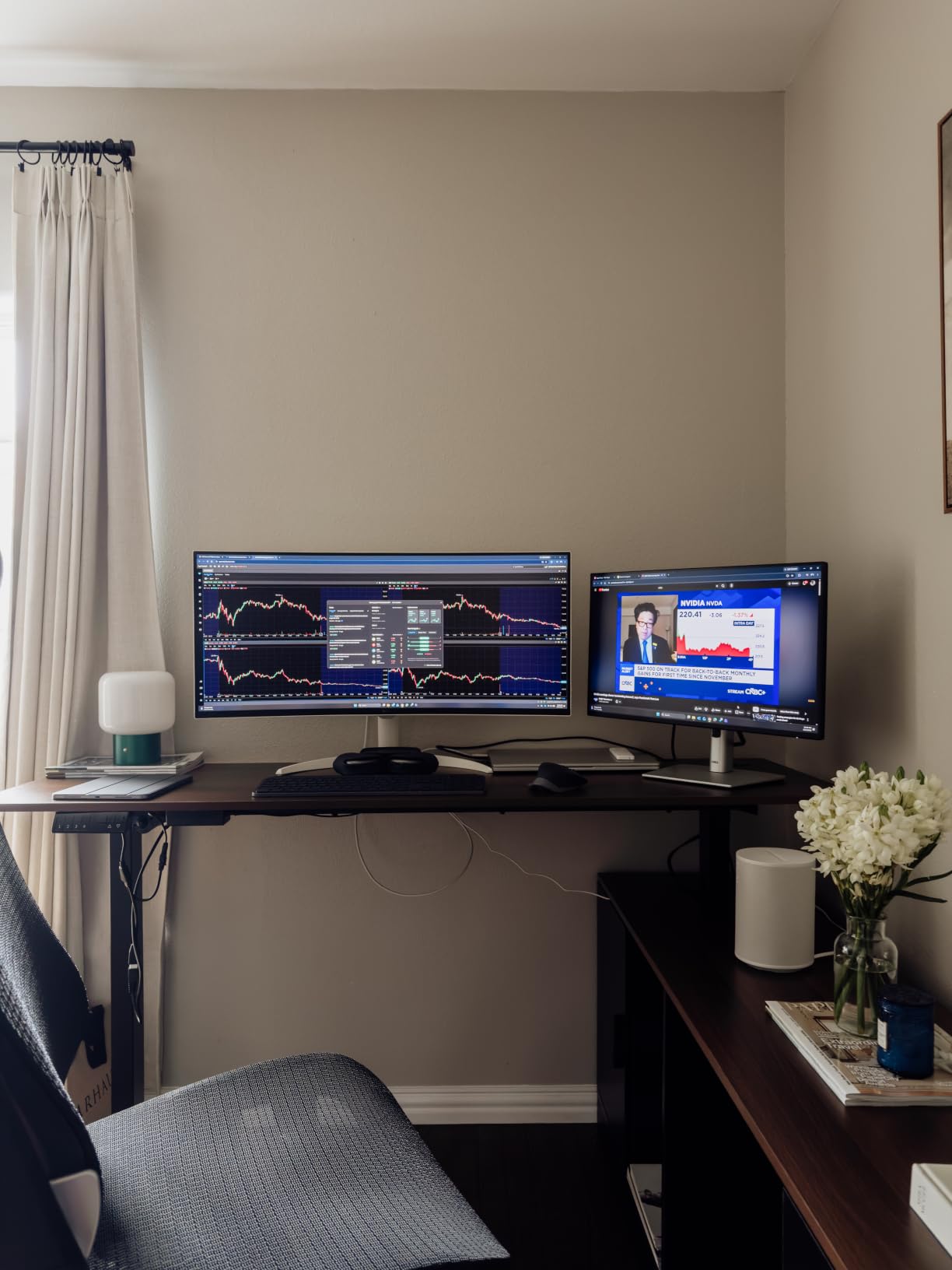
The three-side virtually frameless white design looks deliberate on a modern desk and disappears into a study or living space in a way a black gaming monitor does not. The built-in speaker covers casual audio, and the 100Hz with 5ms response is smooth enough for reading and general use.
Two HDMI and three USB ports is the full complement. There is no DisplayPort and no USB-C, so this is a display-first device rather than a laptop dock, and that is consistent with the smart monitor concept.
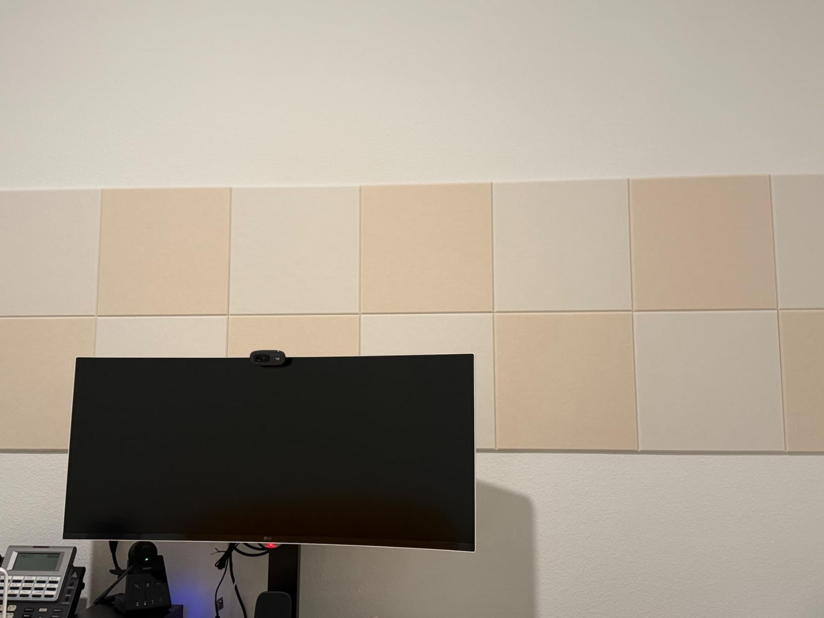
Who this is actually for
Readers who do not want a computer running. Someone who wants a large screen for reference material, coursework or a manuscript, plus a television for the evening, on one device. The 1800R curve and matte finish mean the reading half of that proposition is handled properly.
It is also a good second display for a laptop user, since the smart functions make it useful when the laptop is closed.
Where it falls short
The core criticism in reviews is that you are paying for smart features rather than panel quality, and the underlying 100Hz VA panel is comparable to cheaper 3440×1440 monitors. That is a fair reading of the trade. If your documents live on a computer, the same money buys more density elsewhere.
Adjustment is tilt only, so plan for a riser or a separate arm. No USB-C means no single-cable charging, and the LG Magic Remote for navigating the interface is sold separately, which is an odd extra cost on a device built around an interface.
10. CRUA CR240QA – Best for Small Desks, With a Caveat
CRUA 24″ FHD 100Hz Curved Monitor, 120% sRGB, HDMI/VGA, Frameless, White
24 inch 1920x1080 at 2800R curve
250 nits, 120% sRGB, 8-bit
Sub 1cm body, frameless, tilt
Pros
- Narrow dead space suits a dual-monitor setup
- Blue light filter and flicker reduction for study sessions
- 120% sRGB with 8-bit colour gives detailed text
- HDMI cable included
- White finish suits a light desk
Cons
- The 2800-rated curve is barely perceptible in person
- 1920x1080 at 24 inches means about 92 PPI
- No built-in speakers
- Stand can be wobbly until tightened with a screwdriver
- Some reports of internal hardware failure within a year
We are including this one with a clear caveat, because a curved monitor list that quietly drops the smallest option would not be honest. The CRUA is a 24-inch panel, and at 1920×1080 that is roughly 92 pixels per inch, which sits below our 100 PPI threshold. It is a step below the Acer on sharpness and well below a 27-inch QHD panel.
The curve is the bigger problem for this article’s thesis. The listed curvature is 2800, and reviewers are blunt that it is essentially invisible in person, offering little of the ergonomic wraparound a curved panel is supposed to provide. If you want a curve, this is not delivering one, and we would rather tell you that than let the word curved in the listing do the work.
What it does deliver is colour depth and a clean physical design. 120% sRGB with 8-bit and 16.7 million colours, a 178-degree viewing angle, and a body under 1cm with a three-sided bezel-less screen. For text rendering, the colour spec helps more than the curve does.
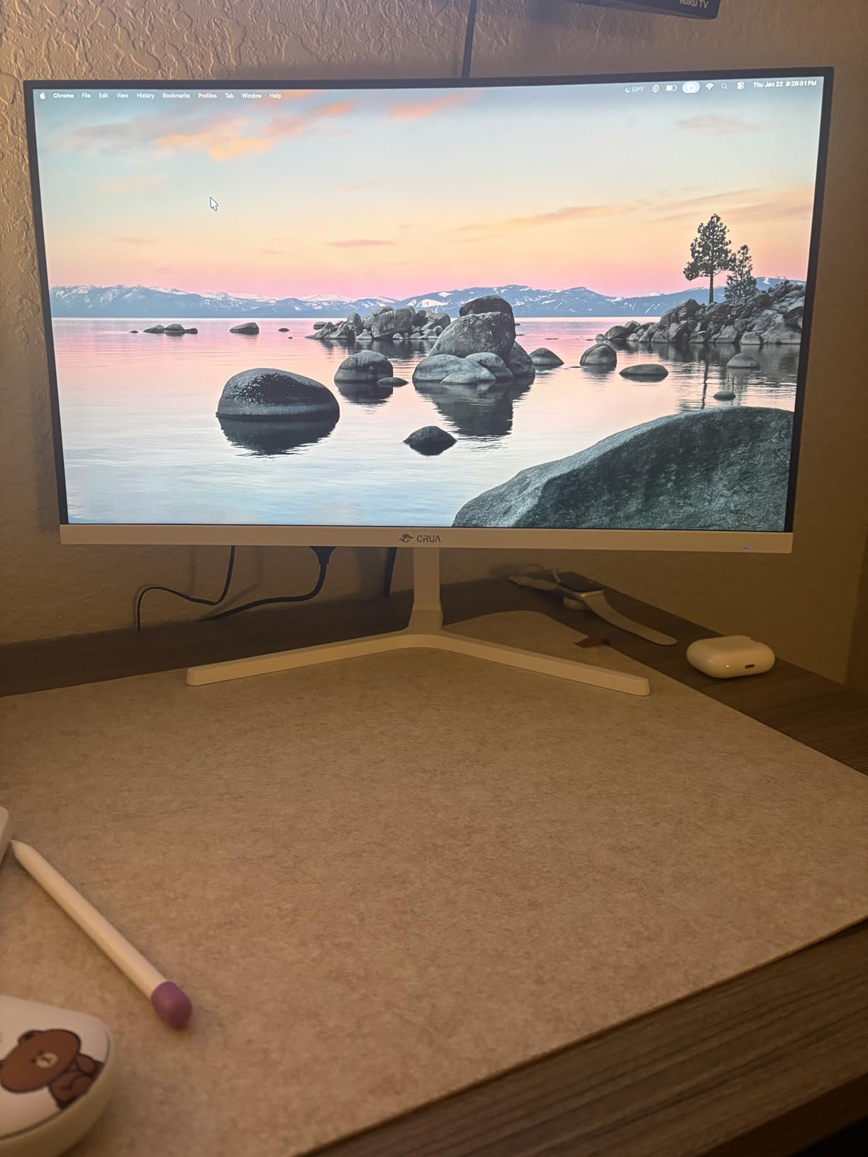
The narrow dead space around the image area makes it a good second panel beside a larger screen, and the white finish suits a light desk. Blue light filter eye care technology and flicker reduction are aimed squarely at long study sessions, and the HDMI cable is in the box, which is more than several picks above manage.
Tilt runs from minus 5 to 15 degrees, and there is no height adjustment. The base is the recurring complaint: owners report it needs tightening with a screwdriver rather than the hand screw, and on-screen menu navigation requires the manual.
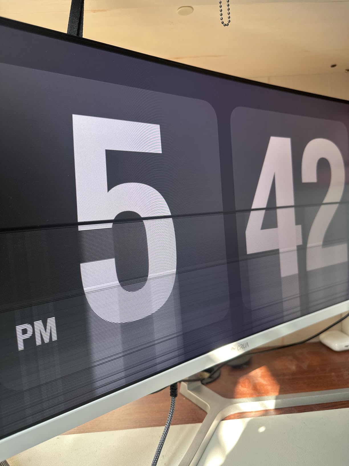
When the small size is the point
A 24-inch panel is a good answer to a specific problem: a small desk, a dorm room, or a second screen where footprint matters more than area. At roughly 92 PPI the text is acceptable rather than sharp, and the 178-degree viewing angle keeps it consistent as you shift position.
For casual reading, coursework and general office work it is a serviceable and good-looking screen, and the colour depth is a genuine plus for anyone who does light editing on the side.
Where it falls short
Read this section as the reason it is last. The curve is not delivering a curve, 92 PPI is below the threshold we set for sustained document work, and there are no speakers. Physical menu buttons take practice and the manual is poorly translated.
There is also a reliability signal worth taking seriously in proportion to the rating: a small number of owners report internal hardware faults such as white bars within a year, against a 4.3 average across more than 1,500 ratings. If a curve matters to you at all, spend on a visibly curved panel instead.
How to Choose a Curved Monitor for Reading
Curvature rating explained
An R-value describes the radius of the curve in millimetres. A lower number means a tighter curve, and the number is the radius of a circle the size of which the screen’s arc approximates. In practice, on curved monitors for reading, 1500R to 1800R is the comfortable range and 1000R is aggressive.
Below 1000R the outer edges curve toward your face, so the first and last few words on a line sit at a different angle and distance than the middle. On a 27-inch panel that is genuinely distracting when you are reading a sentence left to right. On a 49-inch panel the same R-value spreads across far more glass, so the wrap is gentler per unit of width and the geometry works in your favour.
This is why you will see different R-values recommended for different sizes. The number alone means nothing without the diagonal. If you are reading on a screen under 35 inches, stay at 1500R or gentler.
PPI and text sharpness
Pixels per inch is the single most important number on this page. It is calculated by taking the horizontal pixel count and dividing by the screen width in inches, and a straightforward worked example: a 27-inch 2560×1440 panel has a diagonal of about 34.05 inches and about 36.24 inches of width, which gives roughly 2560 divided by 36.24, or about 71 horizontally and about 109 overall once the vertical axis is included. We use the diagonal-based figure throughout because it matches how manufacturers state it.
Reference densities for the sizes in this category:
24 inch at 1920×1080 is about 92 PPI
27 inch at 1920×1080 is about 82 PPI
27 inch at 2560×1440 is about 109 PPI
34 inch at 3440×1440 is about 109 to 110 PPI
34 inch at 5120×2160 is about 139 PPI
49 inch at 5120×1440 is about 108 PPI
57 inch at 7680×2160 is about 80 PPI
Our threshold is 100 PPI. Below that, glyph edges soften and footnotes get uncomfortable, and no software setting fixes it. The forum consensus we found on r/Monitors treats roughly 218 PPI, the density of a 27-inch 4K panel, as the benchmark for genuinely retina-class text. Between 109 and 140 PPI, text is sharp at a normal desk distance. Above 200 PPI you are paying for sharpness you cannot resolve from a chair, unless you are reading at very close range or for low vision.
Panel type: VA versus IPS versus OLED
VA panels deliver the highest native contrast of the three mainstream types, typically 3000:1, which is why most of the picks on this page use them. For text that is simply excellent: black glyphs on a white page keep a hard edge for hours.
IPS panels have lower contrast, often around 1000:1, but far more even viewing angles and usually a more neutral colour response. If you share a screen with someone sitting off to the side, or you work in a bright room where you move around, IPS is the better choice. The trade is slightly softer black text edges at high brightness.
OLED panels render text more sharply than anything else because every subpixel switches off completely, so black is truly black and the glyph edges are clean. For a reading roundup they carry a warning: most are glossy, and a static document on screen for hours is exactly the use case where OLED burn-in is a real consideration. If you want OLED text sharpness, treat panel refresh and burn-in mitigation as a feature to check rather than an assumption.
Subpixel layout and text fringing
This is where most roundups go silent, and it is a genuine factor in how clean small text looks. A standard RGB-stripe layout arranges red, green and blue subpixels in vertical stripes, each pixel rendered as a vertical trio, and it produces the most uniform glyph shapes. Triangular and V-stripe arrangements pack subpixels differently to improve viewing angles at the cost of a subtle colour fringe on small text at close range.
In practice the difference matters most on high-density panels where each pixel is physically small, and on 34-inch 3440×1440 and 5120×1440 panels it shows up as faint coloured edges on characters like lowercase l and i. If you are reading at arm’s length and it bothers you, sit closer or step up in density. Manufacturers rarely publish the layout, so this is one of the few things you can only judge in a showroom or from a close-up photo.
Matte versus glossy and ambient light
Matte or anti-glare coatings scatter ambient light across the panel rather than reflecting it as a coherent image. The practical result is that a lamp, a window or a bright wall produces an even veil across the screen instead of a readable reflection of the room, and text stays visible under all three conditions.
Glossy panels look superb in a dark room and become actively hostile in a lit one. The Philips on this list is the clearest example: the same 3440×1440 panel that would be excellent in a controlled lighting environment is the worst long-reading choice in a bright room. If your reading space cannot be dimmed, matte is not a preference, it is a requirement.
Screen size, resolution and scaling
Size and resolution have to move together, and the mistake most buyers make is pairing a large panel with a low resolution. A 27-inch 1080p screen is 82 PPI. A 34-inch 3440×1440 screen is 109 PPI. The second is a much larger screen with much sharper text, which is the entire reason we rank the Acer first.
On scaling, a useful rule: 27-inch at 2560×1440 and 34-inch at 3440×1440 both run at 100% scaling with comfortable text, because their vertical pixel counts are close. 32-inch at 1440p has the same vertical resolution as a 24-inch 1080p panel, so it usually needs scaling to be readable, and users on r/ultrawidemasterrace report exactly this frustration on 5K2K panels where scaling settings are a matter of personal preference. If you can only set scaling in whole steps, check the native resolution first.
Eye comfort features: what actually matters
Ranked honestly, the levers that change how a document feels are: pixel density, matte finish, brightness matched to the room, viewing distance, and breaks. Flicker-free or PWM-free dimming is a genuine comfort feature at low brightness, and the panels on this page generally include it. Blue-light filters and modes such as Reader Mode, ComfortView Plus, Blue-Light Shift and EasyRead shift the colour temperature warmer, and many readers with sensitive eyes report a real preference for them, but treat them as a comfort setting rather than a proven intervention.
On the question of refresh rate and eye strain, the honest answer is that 60Hz versus 144Hz is not a primary cause of strain. Higher refresh reduces motion smear while scrolling, which some readers find easier on the eyes, but the effect is about smoothness rather than fatigue. If text softness is what bothers you, no refresh rate will fix it.
When Not to Buy a Curved Monitor
A roundup that only argues for its own category is not worth reading, so here is the other side.
You read long tall documents in portrait. Long pages, spreadsheets printed to A4, scanned archival material and code reviews are naturally vertical. Curved panels generally cannot rotate to portrait because the curve makes rotation awkward at best, so a flat panel you can pivot is the better tool.
Your desk is shallow. A 34-inch panel needs real depth. On a small desk you end up leaning forward, which reintroduces exactly the focal-length strain the curve was supposed to remove. Users on TechPowerUp forums describe large-ultrawide strain as the eye repeatedly changing focal length at close distance rather than a fault of the screen.
Your room is bright and you cannot control it. Overhead lighting, a window opposite the desk, or a white wall behind you will make a glossy panel unreadable and a matte panel merely tolerable. Curvature does not help with reflections at all.
You do colour-critical work. The VA panels that suit text and the high-gamut glossy panels that suit imaging pull in different directions, and neither is a calibrated reference display.
You share the screen from different angles. A curve fixes one viewing distance. Several people reading from different seats is a case where a flat IPS panel behaves better for everyone.
You are sensitive to colour fringing. Some subpixel layouts fringe small text at close range, and a curve makes edge distortion more visible than a flat plane does.
If none of those apply, a gentle curve is a genuine improvement for long reading. If two or three do, a good flat high-density panel will serve you better than any curved one.
How to Set Up Your Monitor for Less Eye Strain
The monitor is half the job. These five steps, in order, do more for a long reading session than any blue-light mode:
Set the distance. Sit at roughly an arm’s length, about 22 to 28 inches from a 27-inch panel and a little further for a 34-inch. If you find yourself leaning forward, the screen is too far or the text is too small, and the fix is density rather than posture.
Set the height. Put the top of the screen at or slightly below eye level and look down very slightly at the text. This is the step people skip because it requires a stand that raises, which is why we weight height adjustment heavily above.
Match brightness to the room. If the page glows white against a dim room, turn it down. If you are straining in a bright room, turn it up and fix the lighting on the page instead. Matching the screen’s white point to the paper or the wall around it is the single most effective adjustment available.
Use the 20-20-20 rule. Every 20 minutes, look at something about 20 feet away for 20 seconds. It is the one habit with genuinely broad agreement behind it, and it costs nothing.
Try dark mode for long evening reading. Large blocks of white light at full brightness are harder on some people than light text on a dark background. Test it; some readers are the reverse. Move on if it does not suit you.
If your monitor is one of the picks here with a height-adjustable stand, do steps one and two properly before you judge the panel. A badly positioned 109 PPI screen reads worse than a well-positioned 92 PPI one.
Frequently Asked Questions
Are curved monitors actually better for reading documents?
Partly. A curved panel keeps the centre and the outer edges at a similar viewing distance, which evens out the effort of scanning a long line of text. The decisive factor for text is pixels per inch, and a matte surface finish stops reflections from competing with the page. Choose density first, finish second and curve third.
What is the disadvantage of a curved monitor?
Text warps toward the outer edges in proportion to how tight the curve is. Very aggressive curves on small panels bring the edges too close to your face. Glossy finishes reflect room lighting, most curved panels cannot rotate to portrait for long tall pages, and wide curved screens need a desk around 30 inches deep.
Can curved monitors cause eye pain?
Rarely because of the curve itself. A gentle 1500R to 1800R curve usually reduces scanning effort. Eye discomfort more often comes from soft text at low pixel density, reflections on a glossy panel, brightness that does not match the room, or sitting too close to a large screen.
Which monitor has the best text clarity?
The highest pixel density wins. Among common curved sizes, a 34-inch 5120×2160 panel reaches about 139 PPI and is the sharpest curved option for documents, while a 27-inch 2560×1440 and a 34-inch 3440×1440 both sit near 109 PPI and are sharp at 100% scaling. Subpixel layout also affects how clean small glyph edges look at close range.
Is a 60Hz or 144Hz screen worse for eye strain?
Refresh rate is not a primary cause of eye strain. Higher rates reduce motion smear while scrolling, which some readers find easier on the eyes, but the effect is about smoothness rather than fatigue. Text sharpness, a matte finish and brightness matched to the room matter far more for reading comfort.
Do curved monitors distort images?
Yes at the edges, and in proportion to how aggressive the curve is and how few pixels are spread across the panel. A gentle 1500R to 1800R curve on a high-density panel makes the effect hard to notice, while a tight curve on a low-density screen visibly bends text toward the bezels. This is also why ultrawide monitors sometimes look stretched.
The Verdict
The best curved monitors for reading documents come down to one number. Buy the Acer Nitro EDA270U if you want the single most reliable answer: 27 inches at 2560×1440 gives about 109 PPI, the 1500R curve is gentle enough to read straight across, the matte finish survives office lighting, and the three-year warranty covers the risk on a panel you will stare at for years.
Buy the Dell S3425DW if you want the wider canvas. The same roughly 109 PPI at 34 inches, a deeper 3000:1 contrast that keeps black text crisp, ComfortView Plus for evening sessions, and 65W USB-C for a single-cable laptop desk. The LG 34WR55QK-B is the alternative at that size, adding Reader Mode and Picture-by-Picture if you work with two sources.
Drop to the Samsung Essential S3 or the Sceptre C275W-1920RN when the budget decides, and accept roughly 82 PPI. Skip the Philips in a bright room, because its glossy screen will fight your text, and skip the CRUA if a curve is the reason you are shopping, because the curve is barely there.
Whatever you pick, set the height before you set the picture mode. Updated for October 2026.